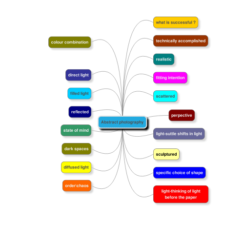
Abstract form in photography
in photography abstract form is about symbolic representation, rejecting the notion that something identifiable must be depicted by a photograph. along with the object being the image its self along with the process to create the image. often the photograph is of part of an object at a certain angle to create the abstract form. In abstract photography dimensions that are rarely seen in other media such as focus can add to the conceptual feel of abstracts by isolating parts of the subject through the use of blur.
in photography abstract form is about symbolic representation, rejecting the notion that something identifiable must be depicted by a photograph. along with the object being the image its self along with the process to create the image. often the photograph is of part of an object at a certain angle to create the abstract form. In abstract photography dimensions that are rarely seen in other media such as focus can add to the conceptual feel of abstracts by isolating parts of the subject through the use of blur.
|
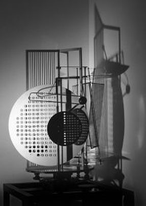
Maholy Nagy's light space modulator evaluation
obviously what has inspired and influenced Maholy work is abstract shapes, form and how they can be created. what I learnt from the video below is that there are lots of very creative ways to create abstract art work just by using shapes to create a abstract shapes that then reflect shadows onto walls. if I where to make a response to this work it may be to make my own space modulator but allot simpler and on a smaller scale as the original one I imagine would have been difficult and time consuming to create one on that scale. What I think is effective about this sculpture is that not just the abstract shadows are very good but the modulator its self in my opinion is in a way a sculpture as the different shapes that hang are very interesting and quite creative. what i think is worth remembering about this style or art work is there is not limit when it comes to creating abstract shapes and just art work in general. what i dislike about this bit of art work is that even though it is for art they could have made it a bit simpler which would i think saved time. what i think they could have improved about it is that they could have made it on a smaller scale and maybe put more time in making the smaller object more abstract and more interesting. |
black and white
|
|
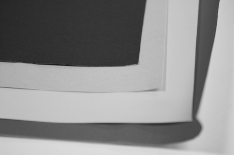
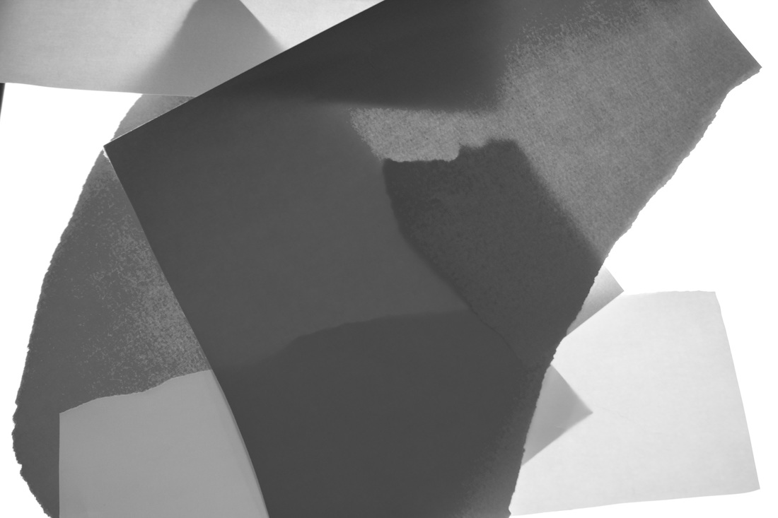
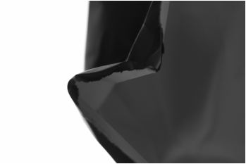
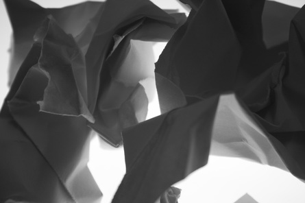
evaluation of black and white /write up
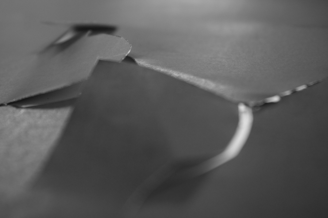
In the images above i have used a light box to help create the different contrasts between the colours and the way the light helps create shadows then once uploaded on to iPhoto and have then simply photos hoped them in black and white to get a better look with the different contrasts. along with taking them from different angles. When i first took these photos i had a an idea of using a light box to help create different effects such as the top left where i put a group peaces of paper to try and create a shadow effect. in my opinion these black and white images is that some could have looked nicer if i had maybe left them in colour or layed out in a better way. what i could have done better maybe contrasted on a aspect of black and which photography and then simply done each black and white photo in that way. what I dislike about these photographs is that some could have been taken from a different angle to help make them look more abstract style photograph. what other people my think of my photographs above is that some of the may not be as abstract as they could have been and
In the images above i have used a light box to help create the different contrasts between the colours and the way the light helps create shadows then once uploaded on to iPhoto and have then simply photos hoped them in black and white to get a better look with the different contrasts. along with taking them from different angles. When i first took these photos i had a an idea of using a light box to help create different effects such as the top left where i put a group peaces of paper to try and create a shadow effect. in my opinion these black and white images is that some could have looked nicer if i had maybe left them in colour or layed out in a better way. what i could have done better maybe contrasted on a aspect of black and which photography and then simply done each black and white photo in that way. what I dislike about these photographs is that some could have been taken from a different angle to help make them look more abstract style photograph. what other people my think of my photographs above is that some of the may not be as abstract as they could have been and
any angle 3D or flat colour
|
|
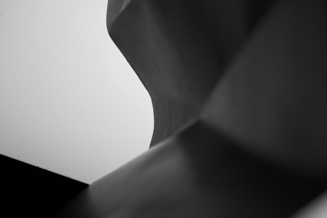
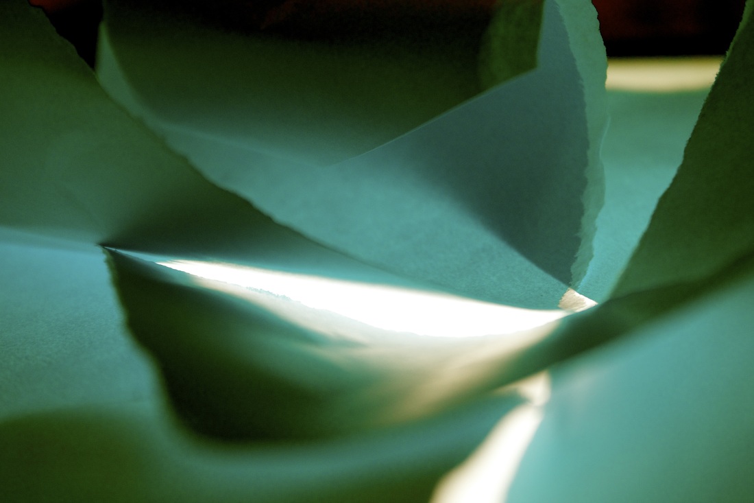
Evaluation of Images above/write up
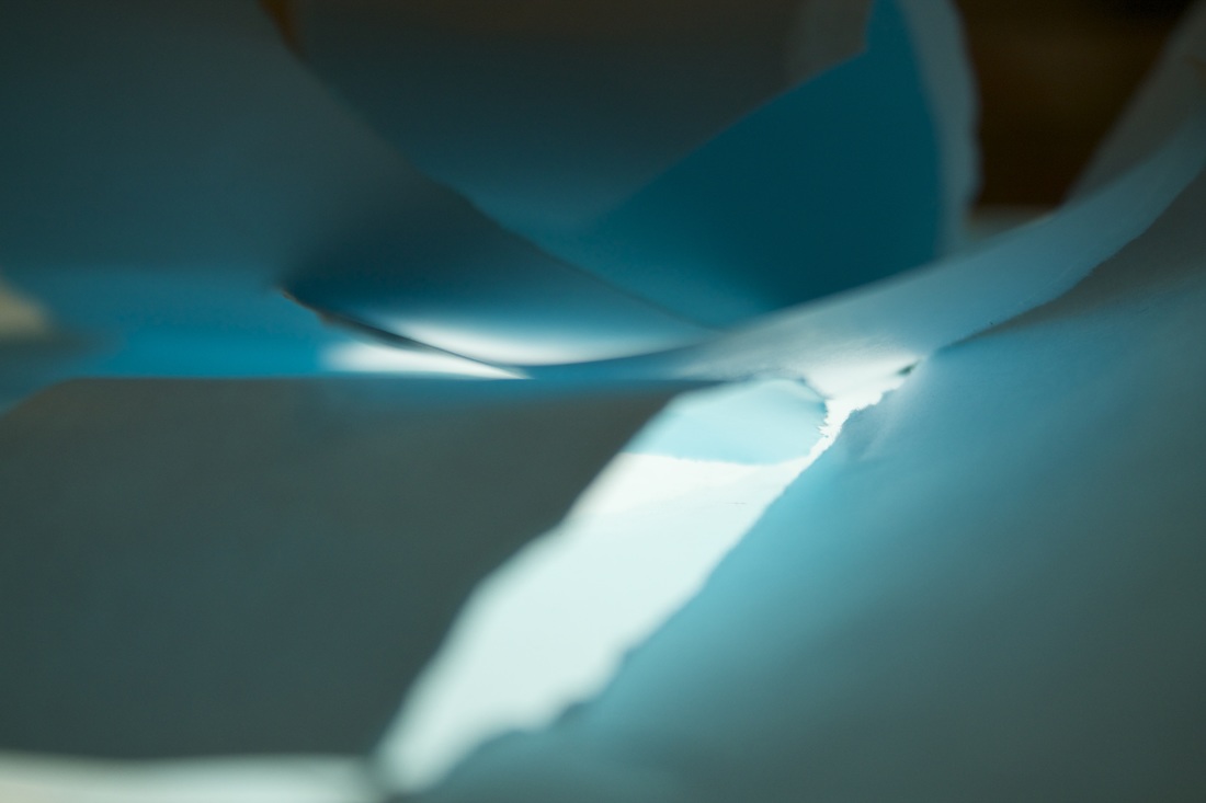
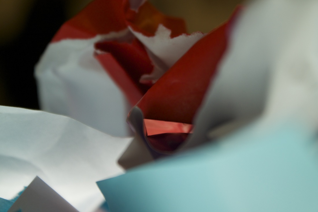
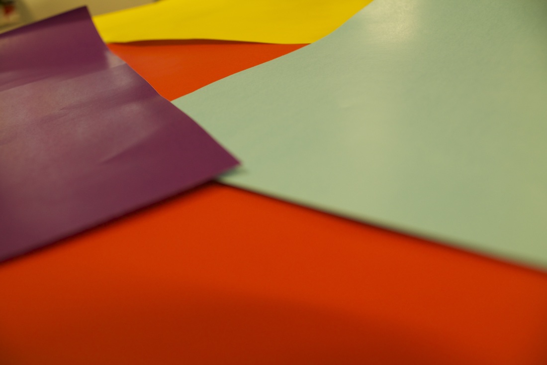
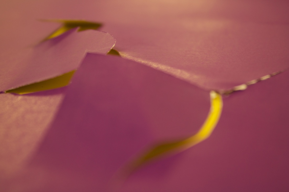
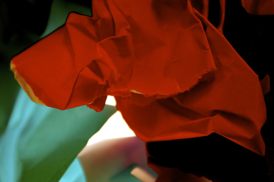
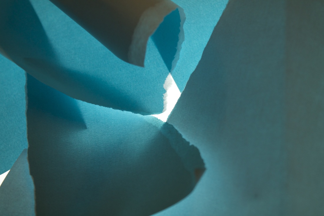
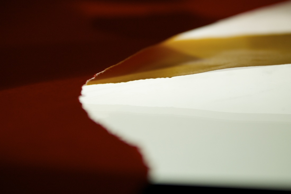
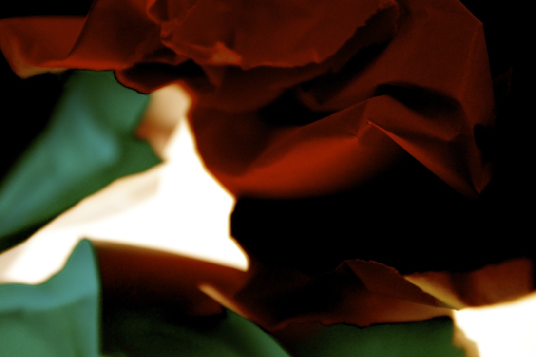
As seen the images above where created by using a light box to help create different effects such as contrast changes or some peaces of paper becoming reflective as well as using the whiteness of the light shining up wards to help create lighter and darker effect on the colour paper as well as the plain paper. Out of the 10 coloured photographs above the one i found to have the most abstract form was the third one down on the right, in this particular photograph i used the light box to help create a contrast between the whiteness of the light and the different colours of the paper. what i think could have been done better with the photographs is to concentrate better on the abstract part of it as in some of them they could have been a bit better. what i learned from the my response from the task is how there are lots of different ideas and angles to take the photograph from as well as what abstract photography is all about. what inspired me when i was taking these photographs was the Thomastallis photograph website which had some examples of some artists work for example with the two photographs at the bottom of this collection i got that idea from the artists vjeko sager who does a smiler thing but with allot more cut out peaces. when it came to what inspired me to use the light box nothing really did i just thought that the light box would help to create a different look to it all.
As seen the images above where created by using a light box to help create different effects such as contrast changes or some peaces of paper becoming reflective as well as using the whiteness of the light shining up wards to help create lighter and darker effect on the colour paper as well as the plain paper. Out of the 10 coloured photographs above the one i found to have the most abstract form was the third one down on the right, in this particular photograph i used the light box to help create a contrast between the whiteness of the light and the different colours of the paper. what i think could have been done better with the photographs is to concentrate better on the abstract part of it as in some of them they could have been a bit better. what i learned from the my response from the task is how there are lots of different ideas and angles to take the photograph from as well as what abstract photography is all about. what inspired me when i was taking these photographs was the Thomastallis photograph website which had some examples of some artists work for example with the two photographs at the bottom of this collection i got that idea from the artists vjeko sager who does a smiler thing but with allot more cut out peaces. when it came to what inspired me to use the light box nothing really did i just thought that the light box would help to create a different look to it all.
