Introduction to Photo Books
During this photo book project the three main things I will be investigating great examples of the photo book form, comparing and contrasting the in which a range of photographers have exploited its affordances. another thing will be explore the history of the photobook and its role as a crucial vehicle for the sharing of photographic images. The third and final thing will be experimenting with the creation of their own photo books first a mock mini photo book then later after taking a large amount of photos then editing them down and making or sending of the photos to be made into photo book then evaluated. an extra thing I will do is allot of research on other photo books and how the artist created these photo books wether i look were the went to take the photo book how successful it was and quite often the photo books very old or two different artists.
What is a photo book?-A photo books or photobook is a book in which photographs make a significant contribution to the overall content. A photo-book is related to and also often used as a coffee table book.
History of Photo books
Julia Margret Cameron created the first photo-book to illustrate a literary work. The 1874 edition of tennyson's Idylls of king contained twelve Cameron images that had been specially created, but reproduced as wood engravings. Cameron sought her own publisher, creating a new version of Idylls of the King, containing her original photographs as albumen prints, which came out in December of the same year. The photo book photographs of british algae: cyanotype impressions was around (1843 to 1853) and was created by Anna Atkins. The book was first released as a partwork to assist the scientific community in identifing of marine species. The non-silver cyantype printing process worked by pressing actual specimens in contact with light-sensitive paper; hence the word "impression" in the book's title. The next photo book to appear was by a guy called William henry fox talbot in 1844-1846 produced a photo book called The pencil of nature. William henry who was the inventor of cyantype process in 1839. Although significant as the first negative/positive photography process, the Calotype was also envisioned as a commercial prospect for the reproduction of images in books through mass publication. Anticipating commercial success, Fox Talbot established purpose-made printing premises in reading to carry out the reproduction of his book. Going back to Fox Talbot photo book witch was released in six parts between 1844 and 1846, to an initially promising list of private subscribers whose numbers dwindled, causing the premature termination of his project.
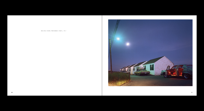
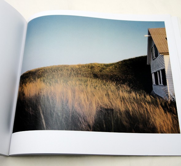
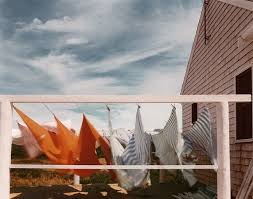
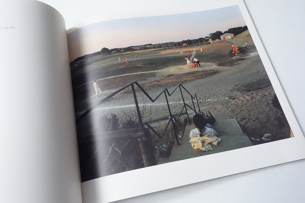
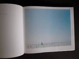
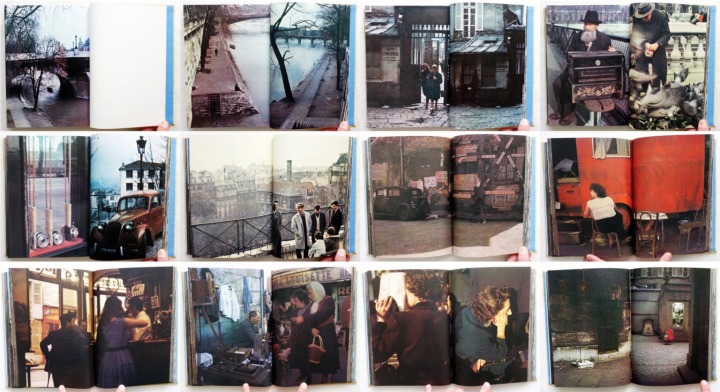
Joel Meyerowitz (1979)-Cape Light
- What is a photo book about?
- cover design:
The photo on the cover page has been centered into the middle and has the look that it might have been cropped from the image in the book to create a different effect on the cover page of the photo book with the tile just above over all giving the book a look of interest in
- What makes the group of photos stand out?
- Does it communicate the photographer’s intention?
Does the style of photography and camera technique suit the subject matter?
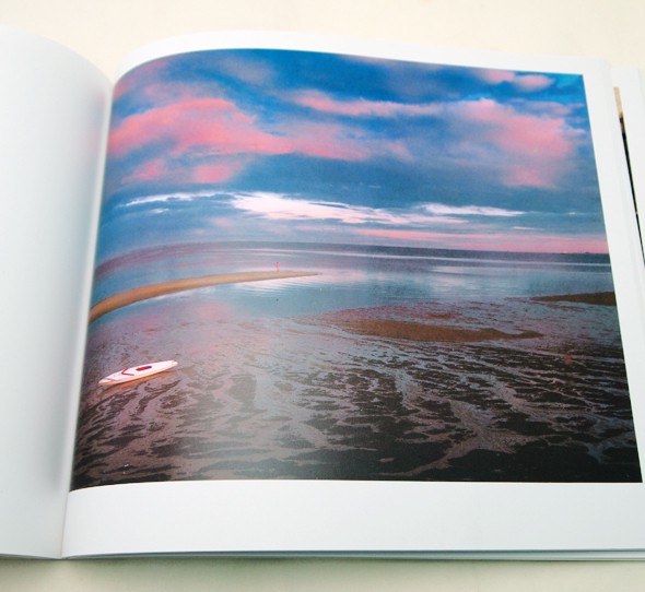
yes because the style of the book Is light and allot of his photos from this book involve cape cod in different seasons with different light epically the photos take on the porch which involve allot of light either natural light like a sun set or artificial light of a lamp shining out onto the porch.
- Does the work feel amateurish or aesthetically sophisticated?
- Page Layouts:
- impact of the overall book
quietly/colour/
in all of the photos in this photo book all seem to be good quietly photographs that have been planed out and thought about before each photograph was taken as well as all the photos being in colour which for most of them makes them a good photograph.
What influenced me/evaluation
What influenced me and inspired me with the first photo book was the way the pages where set out they often had one blank page on the left then the actual image on the right which I think is a bit plane but makes the photos stand out and also makes it more interesting to look at. When it came to wether this particular book would influence me so much that I would want to use colour but mostly weather I would want to use the same layout as well. one thing I disliked about some of the photos is some did seem a bit out of place to the rest of the photos in the way that most of the photos in the book had a similar light, and had no people in them either. Another thing that influenced me with this photo book would have to be that how each image is linked to the next but not completely they have some key differences and that has given me allot of freedom.
What influenced me and inspired me with the first photo book was the way the pages where set out they often had one blank page on the left then the actual image on the right which I think is a bit plane but makes the photos stand out and also makes it more interesting to look at. When it came to wether this particular book would influence me so much that I would want to use colour but mostly weather I would want to use the same layout as well. one thing I disliked about some of the photos is some did seem a bit out of place to the rest of the photos in the way that most of the photos in the book had a similar light, and had no people in them either. Another thing that influenced me with this photo book would have to be that how each image is linked to the next but not completely they have some key differences and that has given me allot of freedom.
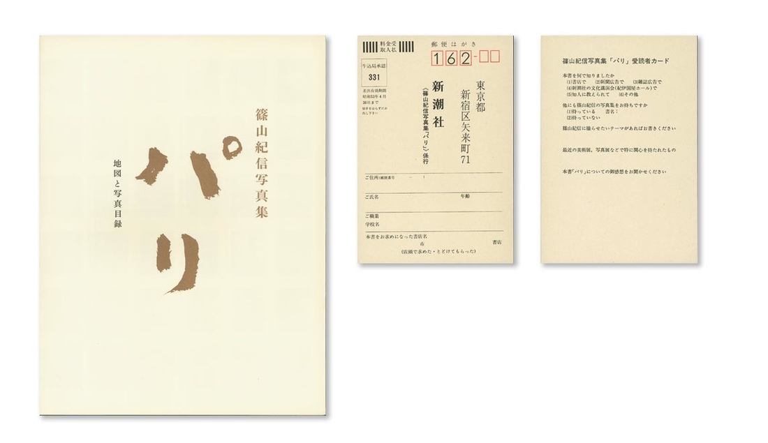
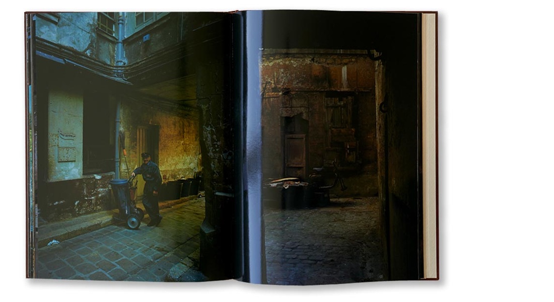
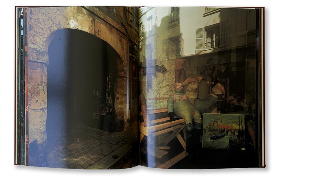
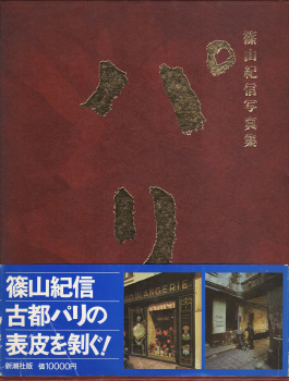
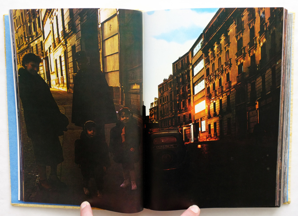
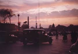
Kishin Shinoyama - Paris (篠山紀信 パリ) photo book 1977
- Subject matter:
- cover design:
strength of the photography:
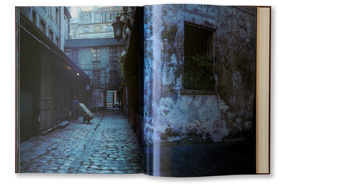
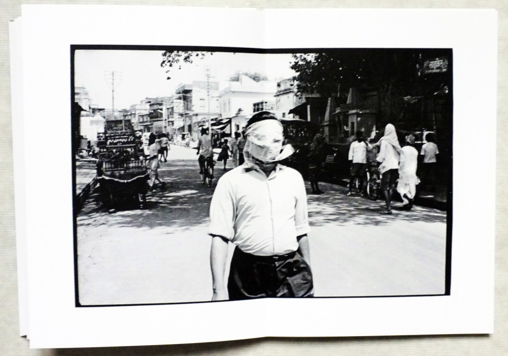
what I think makes the photographs from this photo book really stand out is that each one was taken early in the morning as well as there in each photo the street is empty apart from the odd car as well as the different colours in each photo which gives each photo a very interesting look but at the same time quite weird. in my mind this photo book intention is quite well communicated to the reader as each photo is taken in the morning in empty street which in a way is one of the big things trying to be communicated in this photo book. In my opinion the style of the photo is kind of a surprise when you open the book as you are expecting some very traditional style photos but what you see is very different to what you might expect. The photos don't seem amateurish at all each photo seemed to look very professional like the photos where planned out taken with a good quality camera even with a tripod to make sure photo came out good.
- page layouts:
- text: with the text there is none on any of the pages with photos but he front cover title is in Japanese but written a fancy good colour with the font just being normal Japanese writing with not fancy flicks or curves. and over all the out side of the photo book seems quite sophisticated in well designed.
- impact of the over all book:
What influenced me/evaluation
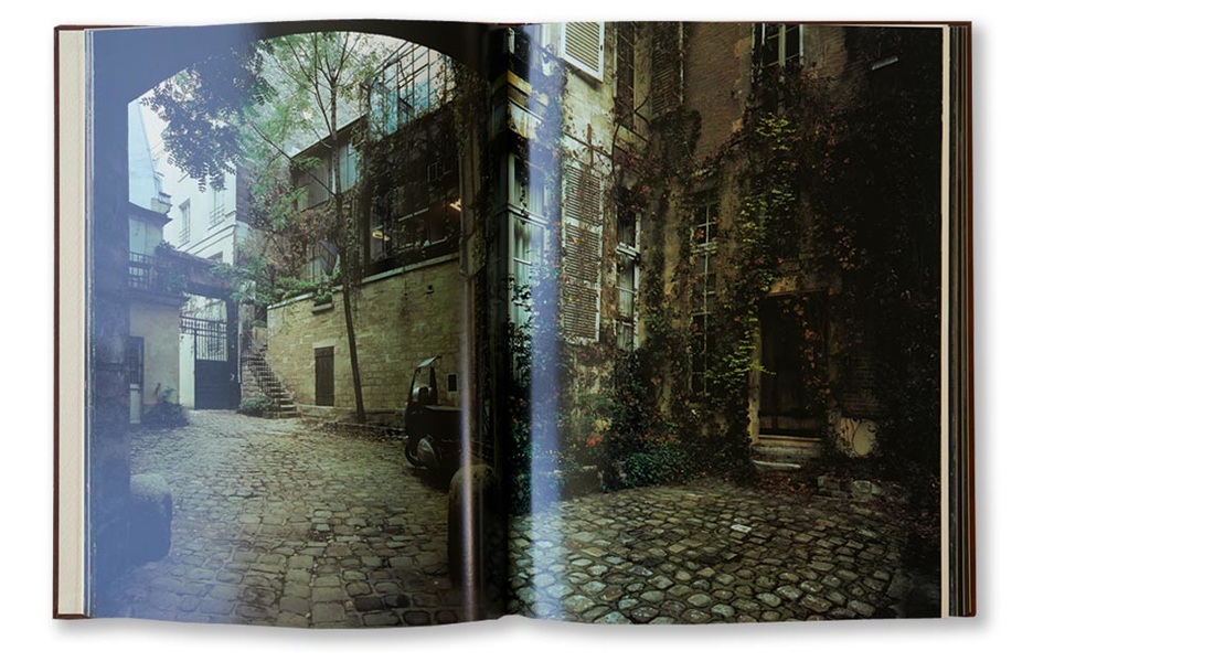
The reason why this photo book interested and influenced me was mostly the style of the book it has a nice look and feel to it along with the images being a full bleed on each page which adds to the images and helps them connect. I also though if Im clever in how I lay out my pages I could use a full bleed design to try and get a similar effect. one thing I don't like about this photo book is that all the photos have this tinge of colour to them none are the same, also they may have looked better in black & white. In comparison to the last book these images are linked allot more so it relates less to my idea and means it influences me less.
The reason why this photo book interested and influenced me was mostly the style of the book it has a nice look and feel to it along with the images being a full bleed on each page which adds to the images and helps them connect. I also though if Im clever in how I lay out my pages I could use a full bleed design to try and get a similar effect. one thing I don't like about this photo book is that all the photos have this tinge of colour to them none are the same, also they may have looked better in black & white. In comparison to the last book these images are linked allot more so it relates less to my idea and means it influences me less.
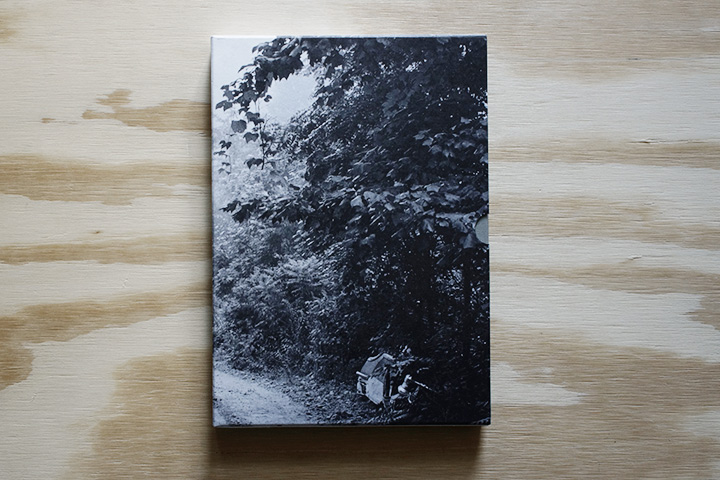
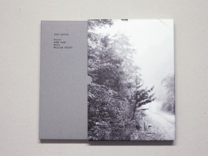
John Cage & William Gedney - Iris Garden Photo Book 2013
- Subject matter:
- Cover design:
- Strength of photography:
- Page layouts:
- Text:
What influenced me/evaluation
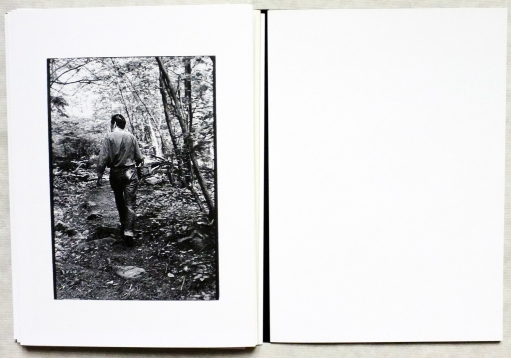
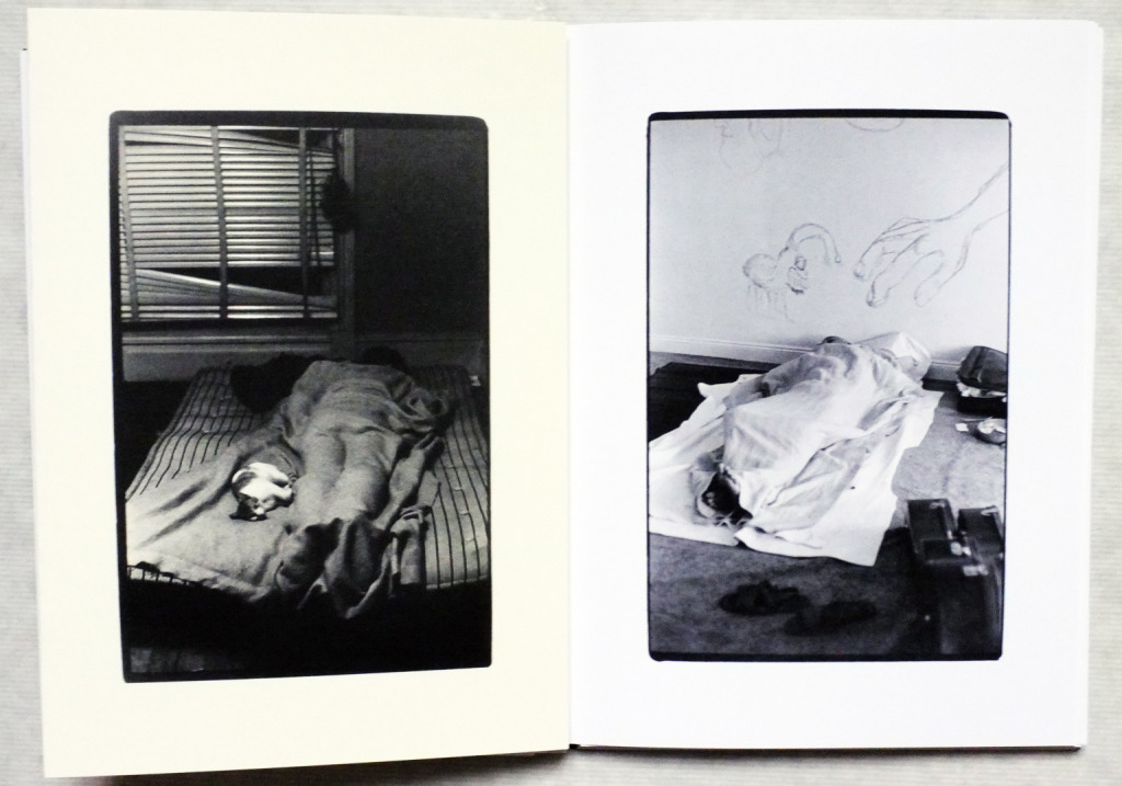
In comparison to the other books I have looked at so far this one has influenced me the most as it is the only black and white book out of the four, also I have found this one to be the most inspiring and helpful out of the four. Also there was two different photographs who's photographs where in this book, which I think adds to it gives it a different look to the rest of the photo books. Another thing is that this book is quite random in the way that yes the photographs link but not allot so which means they made it seem more free which really interested me in comparison to the other books. One thing I dislike about the photo book is how that the images have to much contrast to them which I think ruins some of the photographs.
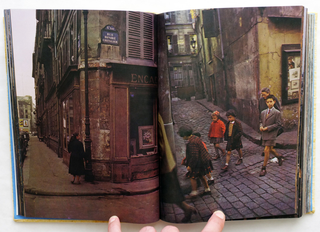
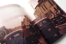
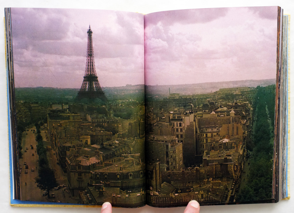
Ihei Kimura - Paris (木村伊兵衛 パリ) photo book 1974
- Subject matter:
- Cover design:
- Strength of the photography:
its difficult to say what the photographs intention is with this book but i think he has communicated it quite well as some of the photo have a bit of a story behind it whether something interesting is going on in the photo or something has happened in the past to the object that has made the photographer think to take it. I think the style as well as the camera technique does kind of link to the subject matter because the subject matter is is showing what paris was like back then and the style of the photographer shows this combined with the camera technique. The work does not seem amateurish as all each photograph is well planned out developed properly I image by the photographer as well as the photographer being a professional.
- Page layout:
like other photo books this one does not have any captions on any of the pages not dates times or locations just the photographs and not when it comes to the layout not white borders each photo takes up the hole page and doesn't seem to look particularly dated or overly designed.
- Impact of the over all book:
does have kind of a lasting power I might think about it for a while and i might decide to pick it up again if I want to look at a particular photo from the book.
Comparison of four researched Photo books
In comparison three of these photo books are from similar years three of them are from 1974(Ihei Kimura), 1977(Kishin Shinoyama), (Joel Meyerowitz) 1979 and John Cage & William Gedney the latest one from 2013 are all quite different apart from Kishin Shinoyama and Ihei Kimura which where both taken in paris at similar times but of different things Ihei toke mostly of general areas around paris but in comparison to Kishin who toke photos of back streets in paris early in the morning. all of the 1977, 1974 and 1979 photo books have a subject matter but with the 2013 John Cage & William Gedney his are just a mixture of John and William photos taken in different but his where completely random. there out of the for photo book I researched all taken in colours maybe with a filter but the most recent one in comparison was taken in black and white with lots of different contrasts.
in my opinion I think that most of these photo where not planned out or set up which I think makes the photo in general better which three of that where photo books taken in the 1970s which where all taken with no set up in comparison with the recent on 2013 which I think in some of the photos had to be set up or just taken at just the right moment to get what he photographers wanted.
in my opinion I think that most of these photo where not planned out or set up which I think makes the photo in general better which three of that where photo books taken in the 1970s which where all taken with no set up in comparison with the recent on 2013 which I think in some of the photos had to be set up or just taken at just the right moment to get what he photographers wanted.
Photo Book plan
For my photo book I have decided to take my photos based and inspired by the photographers John Cage & William Gedney and there book they did together called Iris Garden with some very interesting images in it. For this the cameras I am going to use is a (SLR) Nikon D40 and a Pentax P30 film camera and take mixture of film and digital photographs but both will be in black and white just a mixture of the two types of camera and there effects in black and white photography. The main subject for my photo book will be a mixture of different types images but what inspired me is that the photo book i chose was completely random not real subject matter. I will not just one subject matter but many different ones but mainly contrast and refection which i found a very interesting subject. The photos i will be taking will be a mixture of in one photo just contrast and in another just refection as well as photos that incorporate both formal elements.
development in Book Plan
since the start of the photo book project I have been using both film and digital cameras as the main two subject matters of this photo book are contrast and reflection and with film photography contrast comes out in a really interesting way. But since starting the project I have found sending the film for the negatives to be developed was becoming a long and expensive thing. Then after receiving the developed negatives I tried to use my negative scanner as it would save me money on getting the negatives printed into actual photos but after figuring out how to use the scanner it would simply glitch and fail. so after trying and experimenting with the negative scanner i used the dark room so see how well I could get the negatives to come out. But finally I decided it was being to difficult to use the film camera and get them scanned in to the computer to be used in the photo book.
Displays Straighty
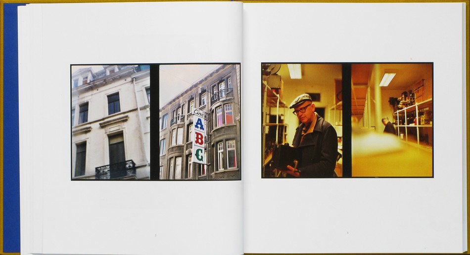
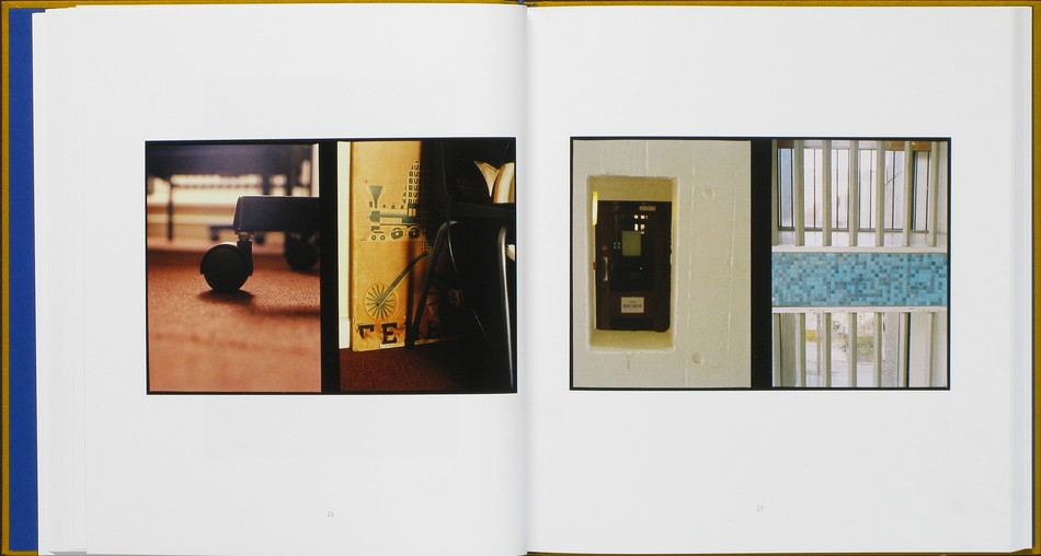
The form of two images taken on the same negative and develops into one picture and how some times how thick or think the line can effect the single or two photographs look and wether they are a good photograph. When it comes to my photo book and how I plan it out I could think of using a split frame camera in my film images I could also think of how I could make the two images link with each other and other could not as well as maybe keeping the two frame photographs but instead of a thick line inpertween they could have not line and just meet in the middle. another thing is that on each page either under so some where next to each image there will be a date and a location it was taken.
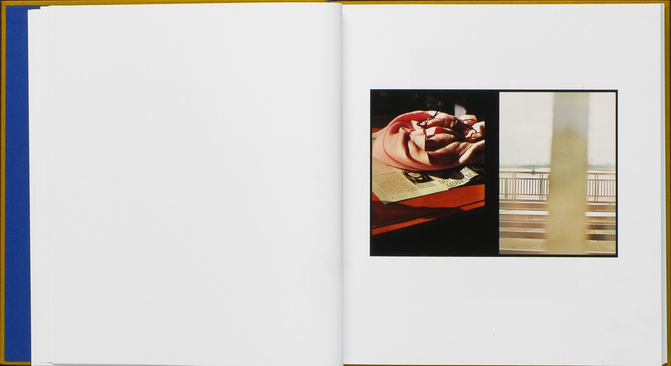
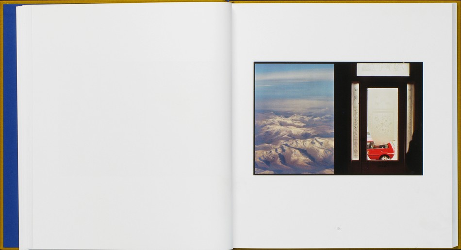
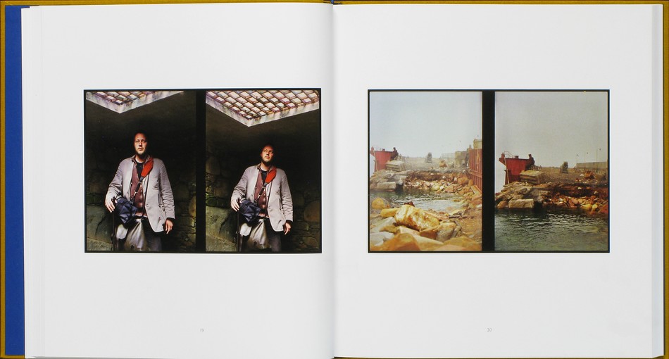
Luke Fowler two Frame Film
Luke fowler was a artist, filmmaker, musician based born in Glasgow in 1978 and in most of his photography there is just one frame like any photograph but in the period between (2006-2012) he started looking at two frame photography and did a photo book on it simply named Luke fowler two frame photography and he used a two frame camera which used a single negatives but with the two frame photography he would take two different photos but the two frame would merge it together into one single photograph. what Luke did with this photo book though was have one of photograph with the black strip line in the middle but in some of the photographs he made them link together and in others he made them completely different subjects all together
There seems two be a visible logic as though out the photo book the photos vary between linking to each others not there also seems to be a well though out page presentation but with a large white border around the photographs which I think could have been avoided If he had made the images bigger on the pages.
The layout doesn't seem overly design but does seem kind of under design as he could have thought about that a bit more as that may have effected how people saw the book at first.
although this book is a good one it doesn't really have a lasting effect in the way that the idea is very interesting i think the photographs are good but not good enough to have a lasting effect on me.
- lay out:
There seems two be a visible logic as though out the photo book the photos vary between linking to each others not there also seems to be a well though out page presentation but with a large white border around the photographs which I think could have been avoided If he had made the images bigger on the pages.
The layout doesn't seem overly design but does seem kind of under design as he could have thought about that a bit more as that may have effected how people saw the book at first.
- impact of the over all look:
although this book is a good one it doesn't really have a lasting effect in the way that the idea is very interesting i think the photographs are good but not good enough to have a lasting effect on me.
Response to the Diptych Two Frame film
|
|
evaluation/write up
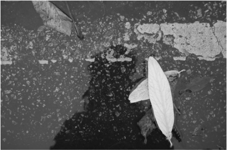
My opinion of these two images above and why these are similar is the objects on the each photograph for example the one on the left is of a plastic container that has been left out side in my garden for a mouth or two and has collected lots of dead leaves as well as allot rain water but what I think actually links them is how the leaves in the image on the right are alive and still attached to the tree but the leaves in the image on the left the leaves are all dead at the bottom of the container which links in the way that they are both the same thing but one is dead and one is alive along with them being the same thing. What may do next time would have to be two chose two images that have a bit more in common when it comes to the shapes the grain the contrast, but mostly with these two images as the contrast on the left image is quite different from the contrast of the images of the right.
My opinion of these two images above and why these are similar is the objects on the each photograph for example the one on the left is of a plastic container that has been left out side in my garden for a mouth or two and has collected lots of dead leaves as well as allot rain water but what I think actually links them is how the leaves in the image on the right are alive and still attached to the tree but the leaves in the image on the left the leaves are all dead at the bottom of the container which links in the way that they are both the same thing but one is dead and one is alive along with them being the same thing. What may do next time would have to be two chose two images that have a bit more in common when it comes to the shapes the grain the contrast, but mostly with these two images as the contrast on the left image is quite different from the contrast of the images of the right.
Evaluation/Write up
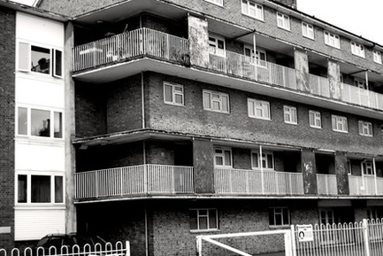
My opinion these two images above is that each of them have allot of different contrast to them for example the one on the top left is of a old block of flats and using the black and white mode on my Nikon D40 I concentrated while taking this photo what would make it have allot of different contrast and to create the vast amounts of different contrasts I made sure when taking this photograph it would be on a sunny day with lots of sun light to create lots of shadows which in a black and white photograph would create allot different contrast with greys, black and white colours. the main reason why I thought these two images would go well together as a diptych was that both had allot of different contras to them as the one on the right of the guy sitting down his hand are very light grey colour but his trousers are a very dark black colour and this contrast very well with the photograph on the left which has a range of contrast.
My opinion these two images above is that each of them have allot of different contrast to them for example the one on the top left is of a old block of flats and using the black and white mode on my Nikon D40 I concentrated while taking this photo what would make it have allot of different contrast and to create the vast amounts of different contrasts I made sure when taking this photograph it would be on a sunny day with lots of sun light to create lots of shadows which in a black and white photograph would create allot different contrast with greys, black and white colours. the main reason why I thought these two images would go well together as a diptych was that both had allot of different contras to them as the one on the right of the guy sitting down his hand are very light grey colour but his trousers are a very dark black colour and this contrast very well with the photograph on the left which has a range of contrast.
|
|
Evaluation/Write up
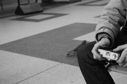
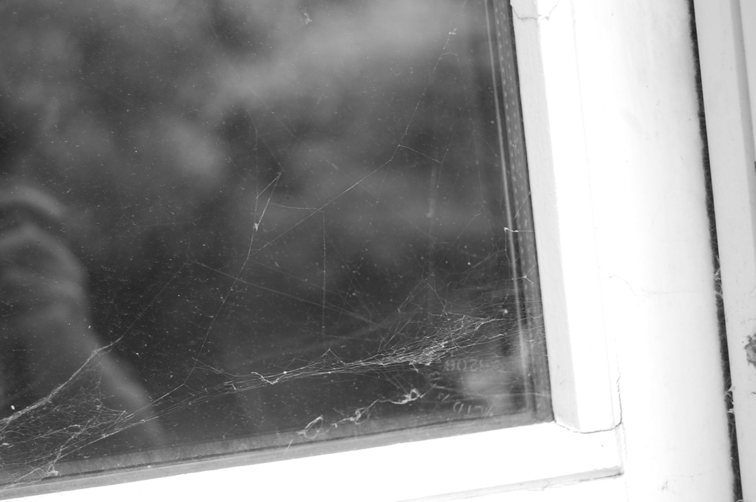
My opinion of these two images above and why I thought they are similar and should belong in a diptych. The first reason and the most obvious is that they are both reflection but one was taken in a refection of water and the other a window but in a way it still makes them linked and related. The main reason why I think those go well together in as a diptych is that both of them have the person who is taking the photograph in them for example the one on the left is of a person standing over a puddle taking the picture and at first glance you may not think that it is even a person standing over the water. And with the image on the right it is a bit more obvious as you can see the photographer hand whilst he is holding the camera.
My opinion of these two images above and why I thought they are similar and should belong in a diptych. The first reason and the most obvious is that they are both reflection but one was taken in a refection of water and the other a window but in a way it still makes them linked and related. The main reason why I think those go well together in as a diptych is that both of them have the person who is taking the photograph in them for example the one on the left is of a person standing over a puddle taking the picture and at first glance you may not think that it is even a person standing over the water. And with the image on the right it is a bit more obvious as you can see the photographer hand whilst he is holding the camera.
What I learnt from the photo books above.
What I mainly learnt from the photo books above is how each one is different some times its a huge difference with the subject matters and other times all though the subject matters are different the images could have been taken in the same location. Another thing I learned was that most photo books had a subject matter which is a subject that the photographer had concentrated on percific thing such as contrast, reflections, frame and light. Adding to that I have also learnt from these photos would have to be the difference in some of them and the time they where taken for example Ihei Kimura book was take in 1974 and John Cage & William Gedney 2013 which means the photos in both of them differ by quite allot. What I have found the most inspiring about this these is the style and quality of the photos in the photo book especially Iris Garden Photo Book from 2013.
research on chosen photographer for photo book: William Gedney
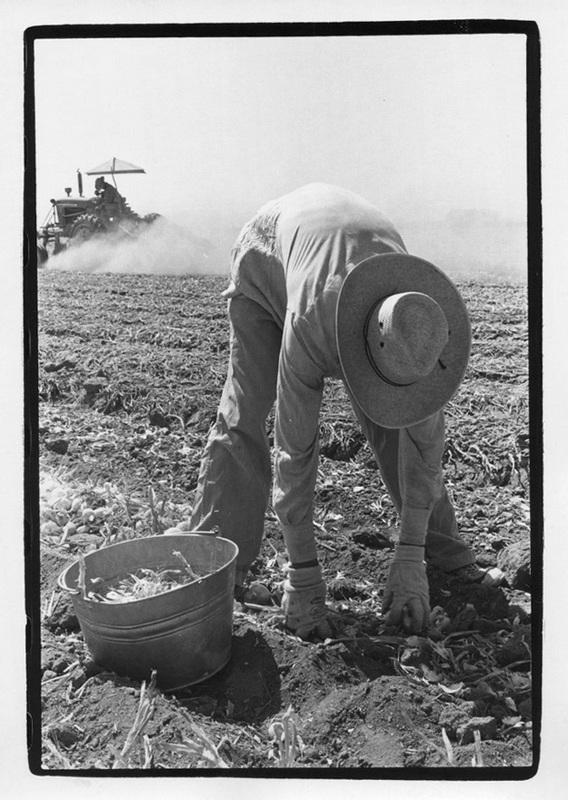
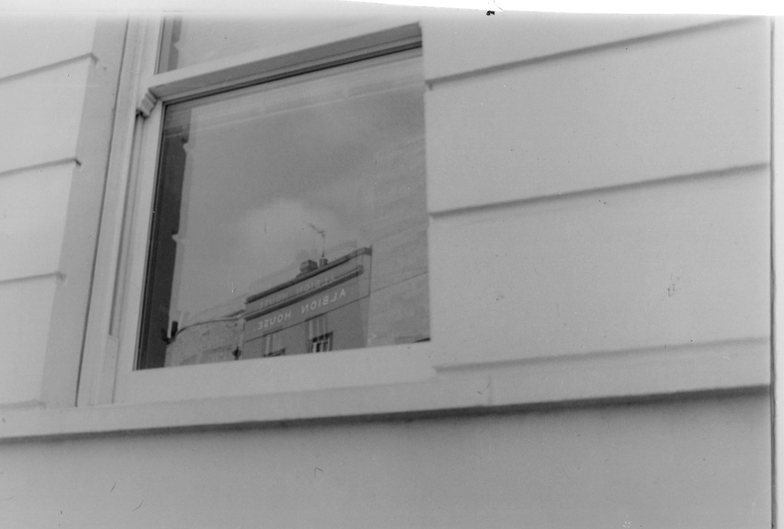
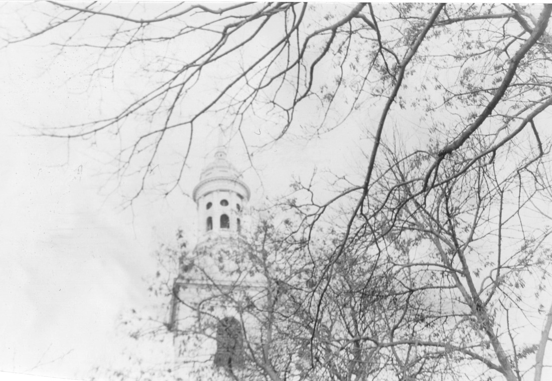
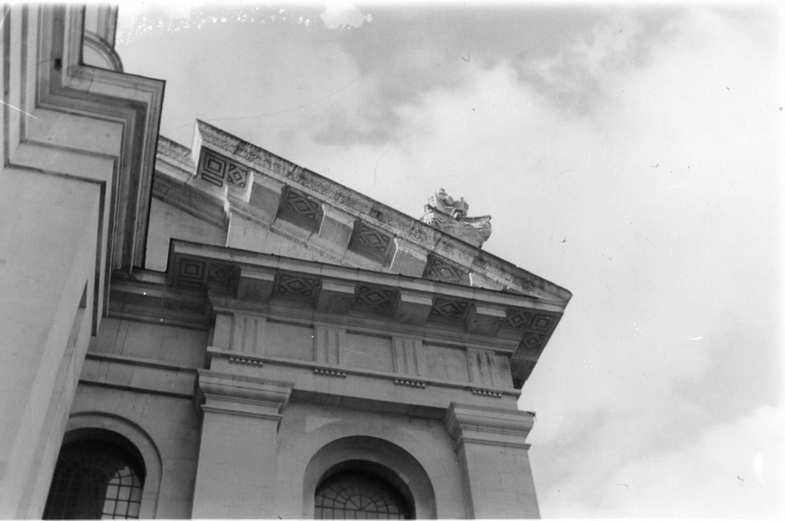
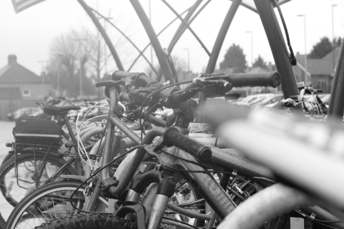
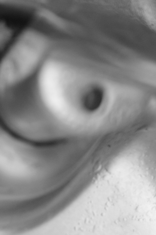
In a lot of Williams photography is street photography in the way that they are all completely random order unlike most photographers who do mix of street photography and generally photography with a subject such as contrast. so for my photo book i have decided to do more of a random photo book then a well planned out book as I like to have more freedom when taking photos than just having to stick to one subject and all the photos being very similar and no wriggle room. What inspired me to do contrast as one of my subject matters for my photo book is the photo book William and another photographer named John cage did together quite recently in 2013 where the book two a serious of random photos but quite allot of them have a hell of lot of contrast but what i really like about the book is the randomness there was no real subject matter to the photo book. My opinion of William's work is that It varies in as some of the of the photos below have quid a few people all doing different things . What I find interesting about his work is that each one with the people in it look different I the sense that some look set and posed while others are taken purely on chance.
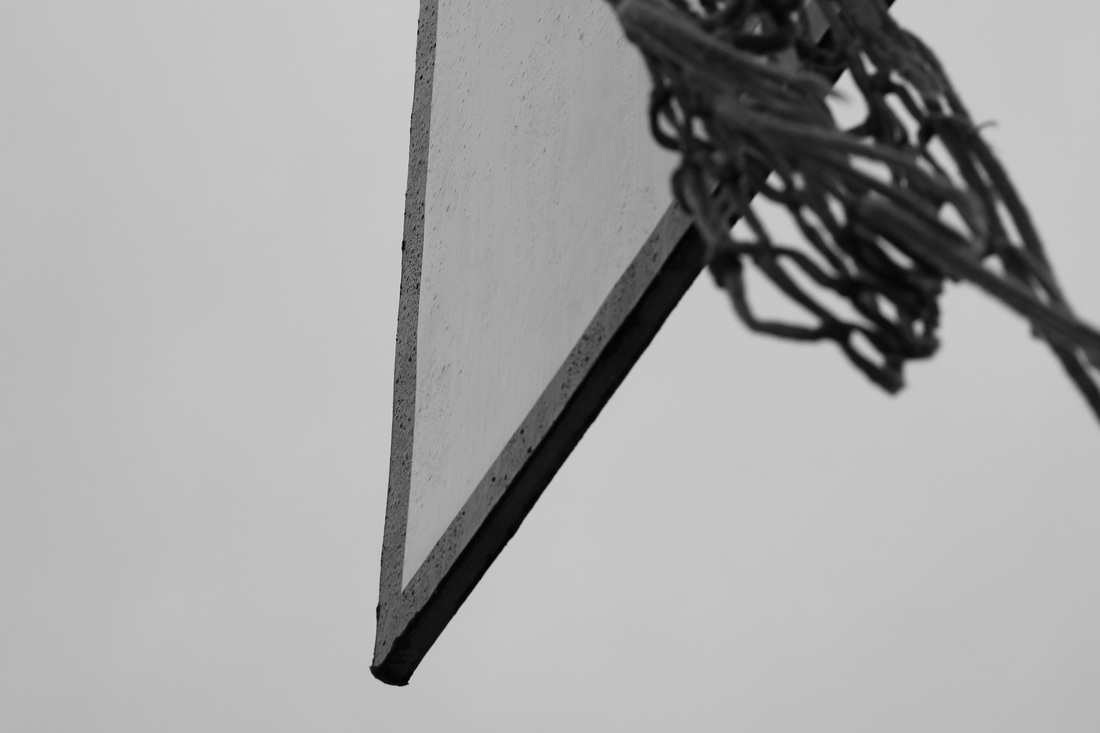
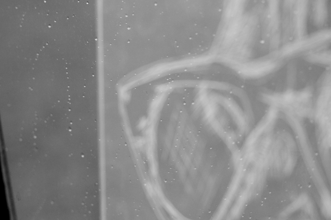
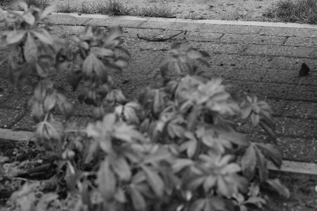
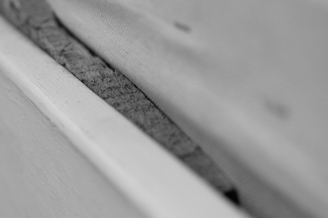
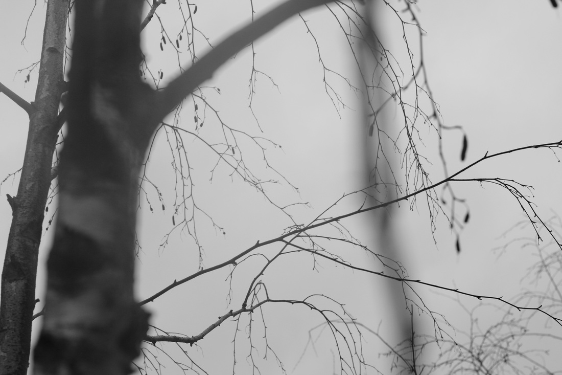
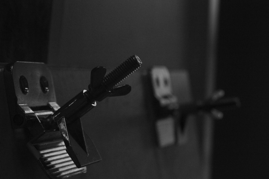
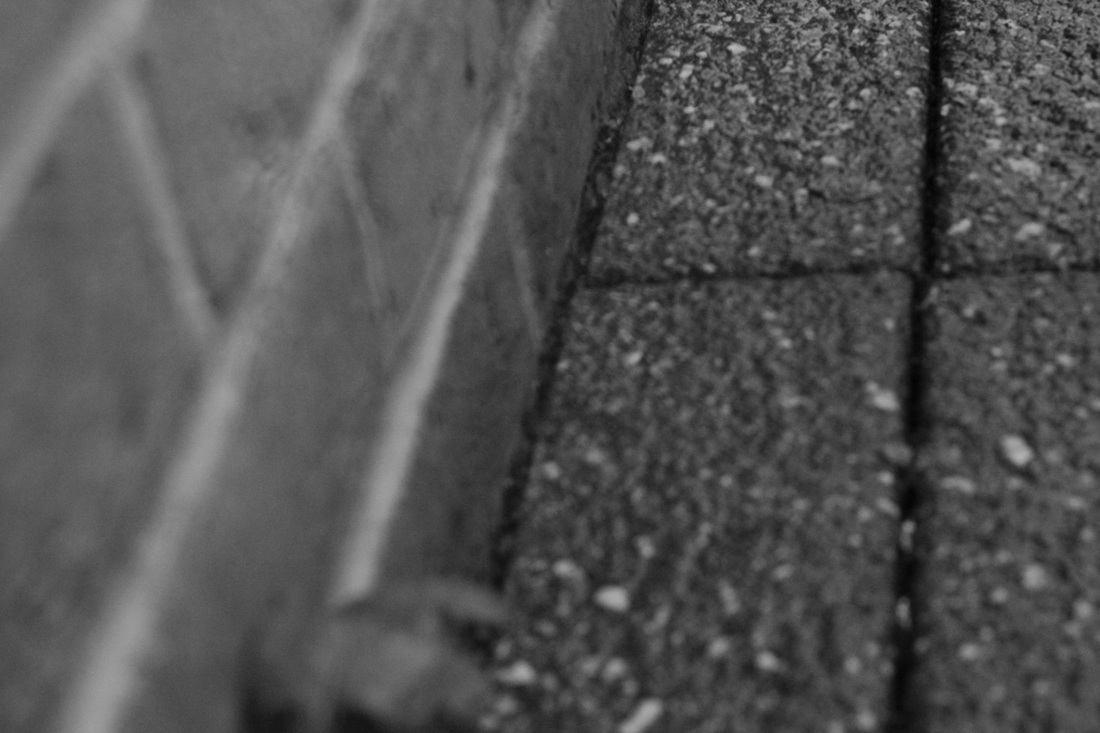
link to all photo book images taken not edited
first set of printed negative experiments
Evaluation/explanation
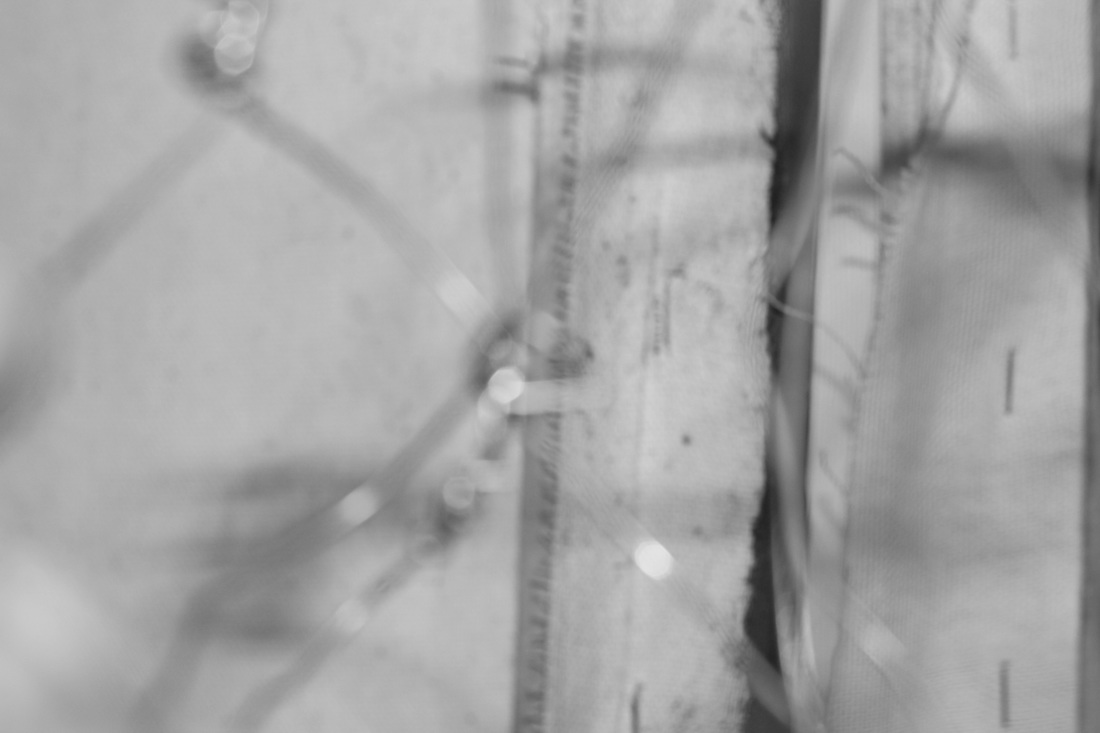
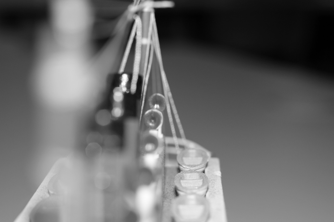
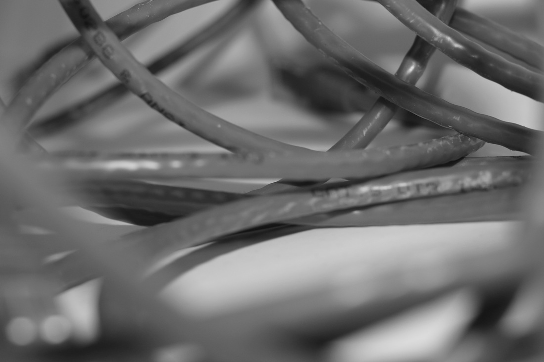
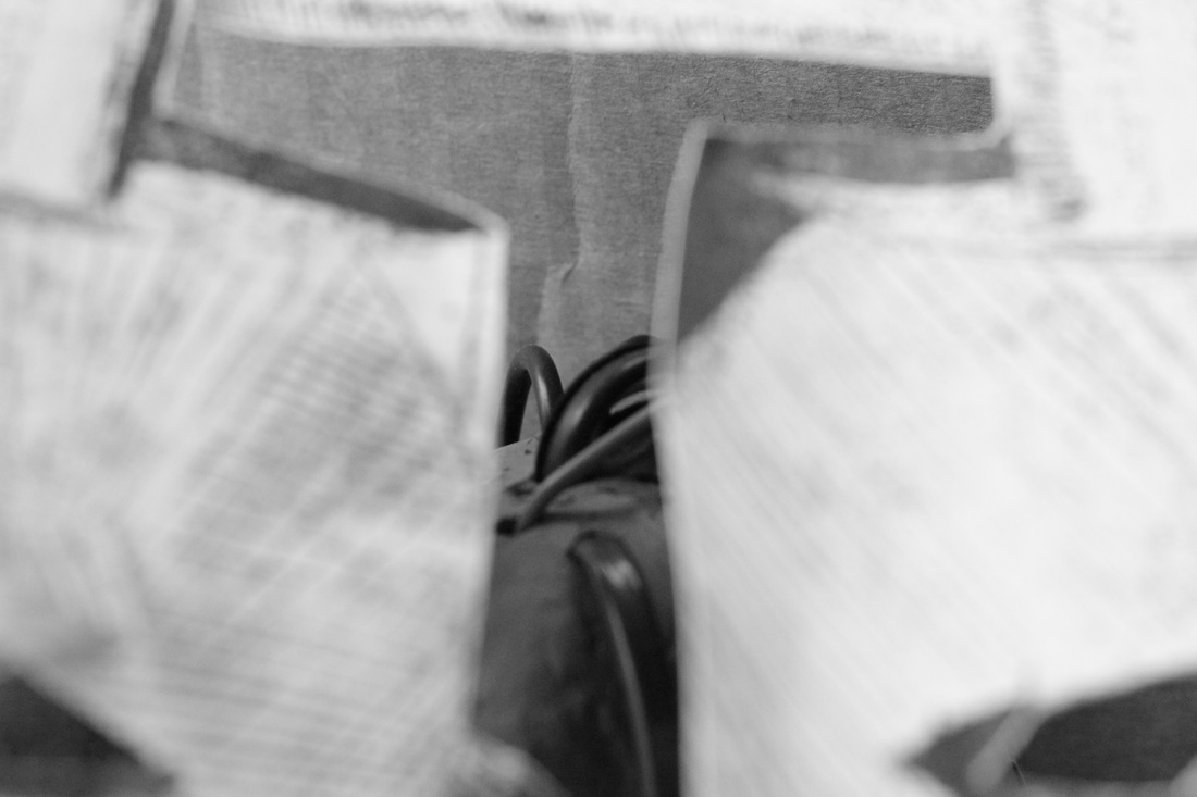
Above are a set of nine printed negatives that i experimented with to see how they looked printed most of these photos above did not come out perfect either they where over exposed or when I used a pink filter it overexposed even more. another problem was the chemicals I used had been sitting there all day and turned out to be very dirty which effected a few of my photos and how they came out. What I found interesting about these photos and the developing process is figuring out what aperture and time when using the enlarger to developing it. when it came to using the film camera for this project I found it very difficult for me to develop a perfect photo in the dark room and the cost of getting these rolls of film developed ended up costing to much so i am simply not going to use film cameras in my photo book.
Above are a set of nine printed negatives that i experimented with to see how they looked printed most of these photos above did not come out perfect either they where over exposed or when I used a pink filter it overexposed even more. another problem was the chemicals I used had been sitting there all day and turned out to be very dirty which effected a few of my photos and how they came out. What I found interesting about these photos and the developing process is figuring out what aperture and time when using the enlarger to developing it. when it came to using the film camera for this project I found it very difficult for me to develop a perfect photo in the dark room and the cost of getting these rolls of film developed ended up costing to much so i am simply not going to use film cameras in my photo book.
first experimental home made photo book
evaluation/ explanation
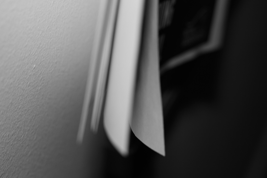
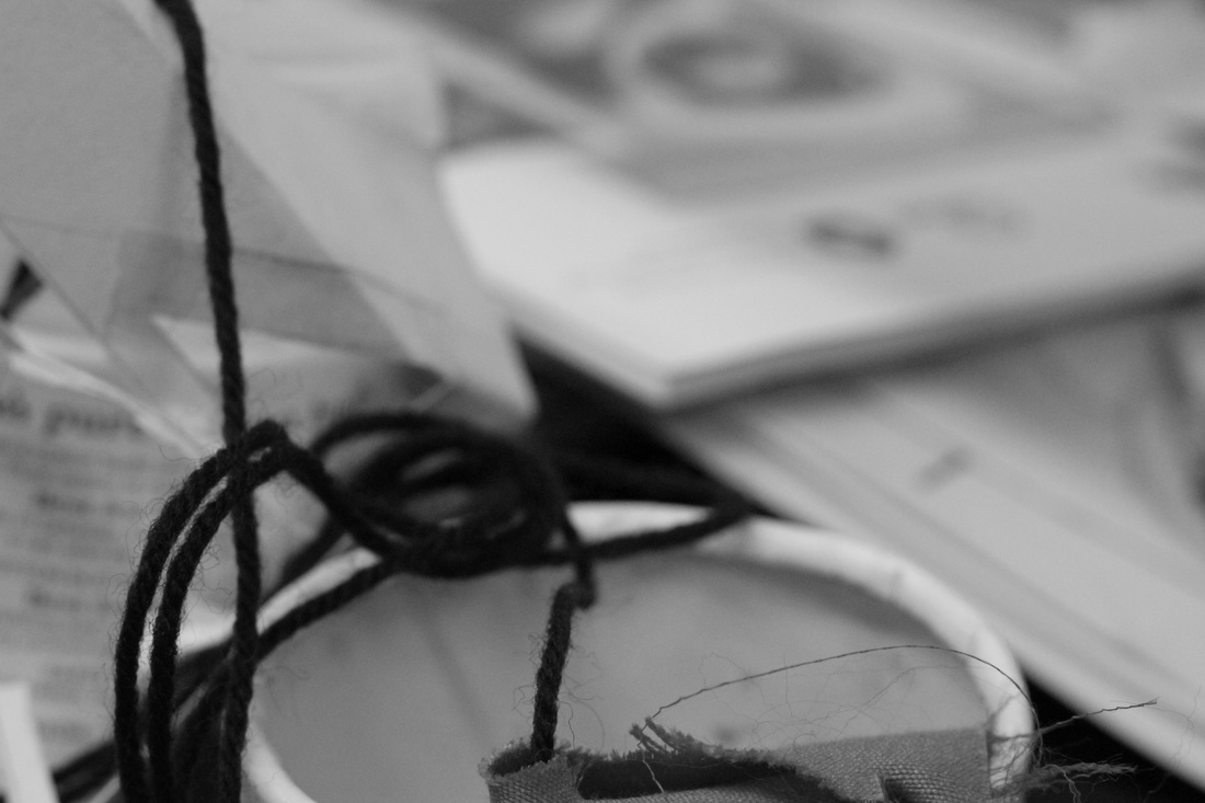
With this photo book each photo I took I was aiming to make a part of it blurt by shaking the camera or not holding it straight to try to make the photos look a bit more interesting. when it comes to the filter i chose at random and started taking pictures and it created quite an interesting effect. what I could improve on next time is maybe to make the finish of the book a bit better also I may try a different idea to do instead of shaking the camera I my not look through the view finder and then wait in till I've taken a certain amount of photos before I look at my photographs. how this photo book images compare to mine is that the ones I have taken for the final photo book where all taken using the view finder as well as selecting which photos I like instead of just using all the photos I took like in this mock photo book above. another way this compares is that the photos I took for my photo book where all taken on the subject matter of street photography and just me walking around and photographing any thing interesting. what I thinks is effective about these photos above is the colour and how the blurred parts have made the photographs really interesting. I think other people may think that in some of the photos that the blurred idea and part may make the photo look bad or just not clear when you are looking at the photograph.
With this photo book each photo I took I was aiming to make a part of it blurt by shaking the camera or not holding it straight to try to make the photos look a bit more interesting. when it comes to the filter i chose at random and started taking pictures and it created quite an interesting effect. what I could improve on next time is maybe to make the finish of the book a bit better also I may try a different idea to do instead of shaking the camera I my not look through the view finder and then wait in till I've taken a certain amount of photos before I look at my photographs. how this photo book images compare to mine is that the ones I have taken for the final photo book where all taken using the view finder as well as selecting which photos I like instead of just using all the photos I took like in this mock photo book above. another way this compares is that the photos I took for my photo book where all taken on the subject matter of street photography and just me walking around and photographing any thing interesting. what I thinks is effective about these photos above is the colour and how the blurred parts have made the photographs really interesting. I think other people may think that in some of the photos that the blurred idea and part may make the photo look bad or just not clear when you are looking at the photograph.
The 48 photos for the second practise photo book
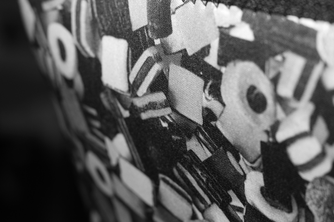
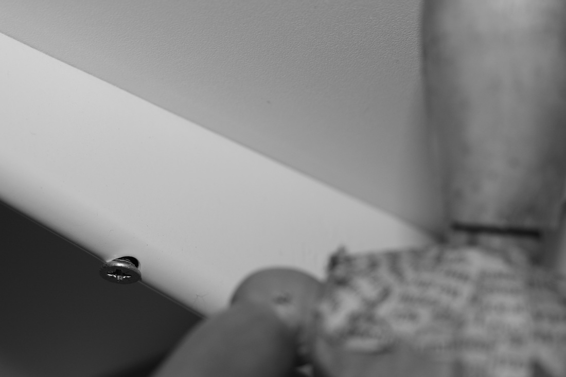
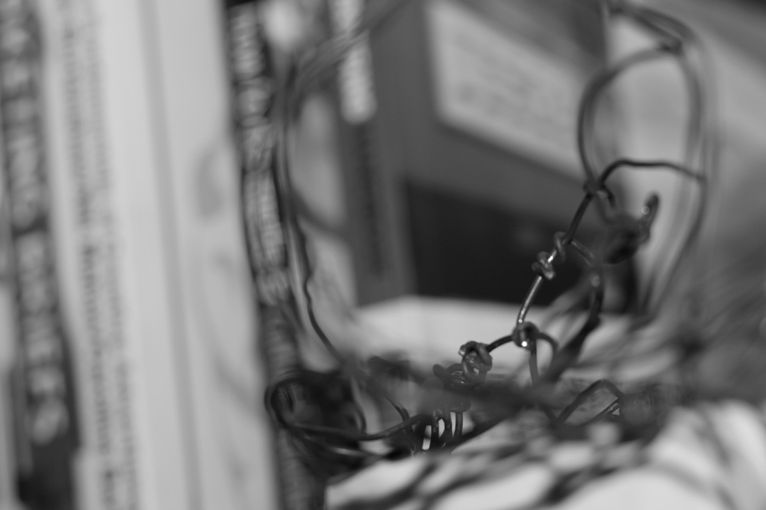
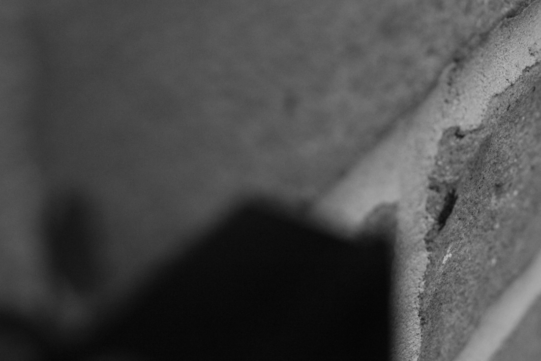
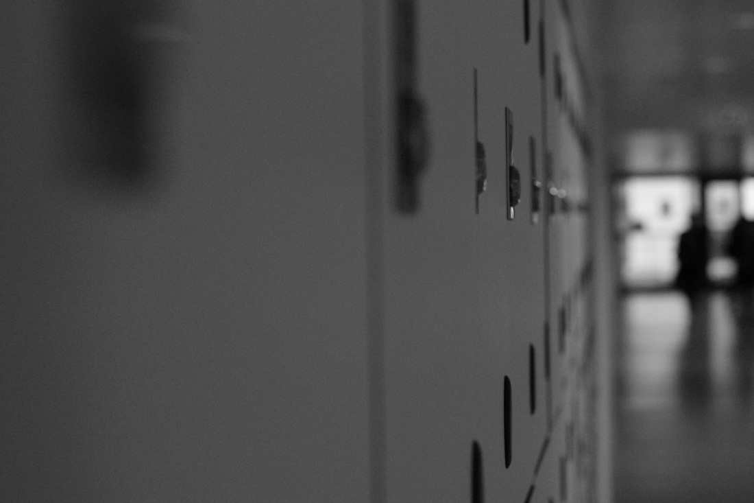
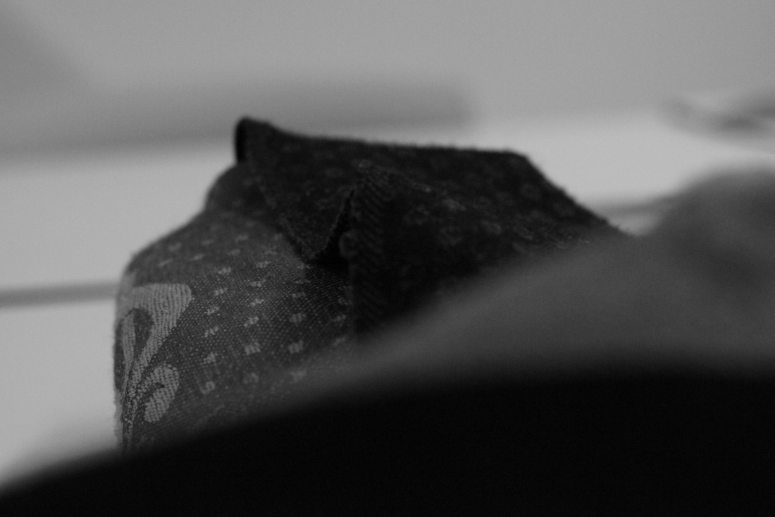
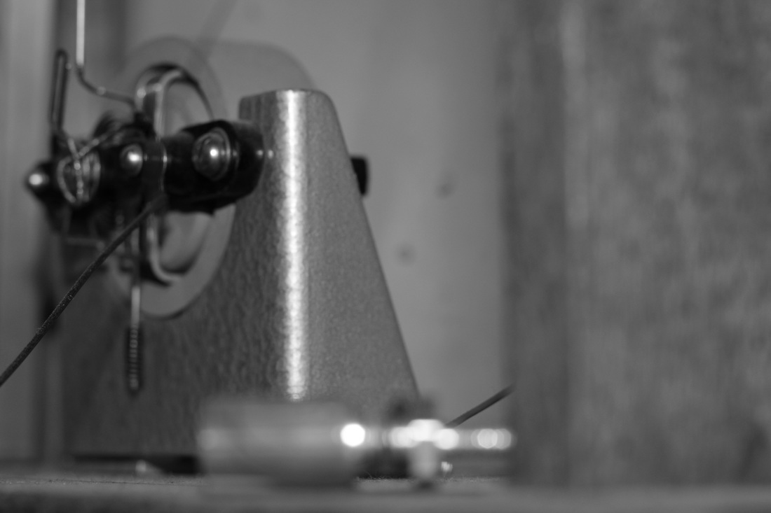
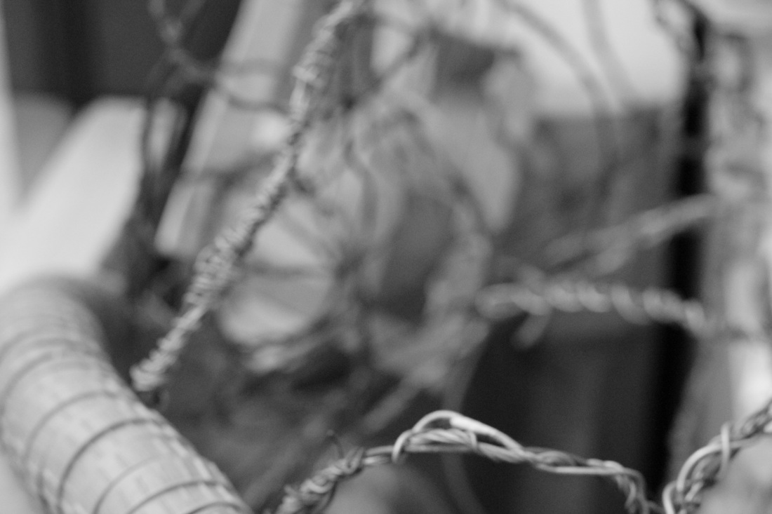
What I did with the images above was using a 50 mm lens I went around my school taking these abstract style photographs from my little photo book above. What I dislike about some of the photos above is that it would of made a much more interesting set of images. What I like about some of the images though is that
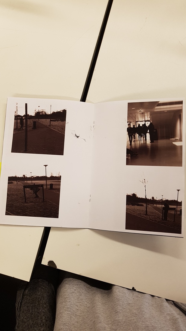
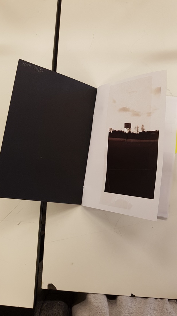
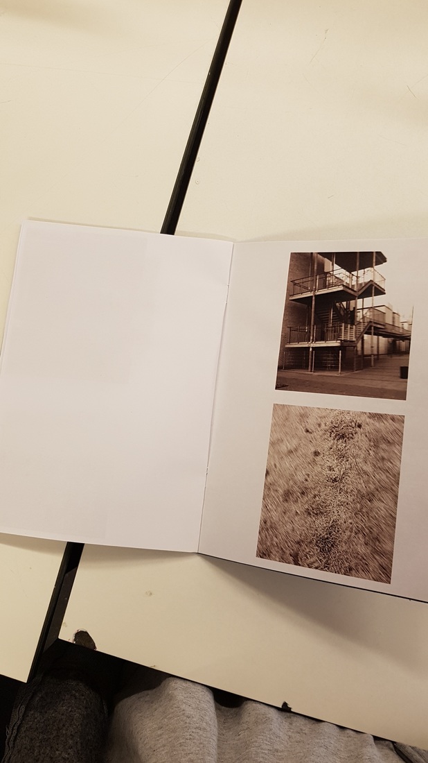
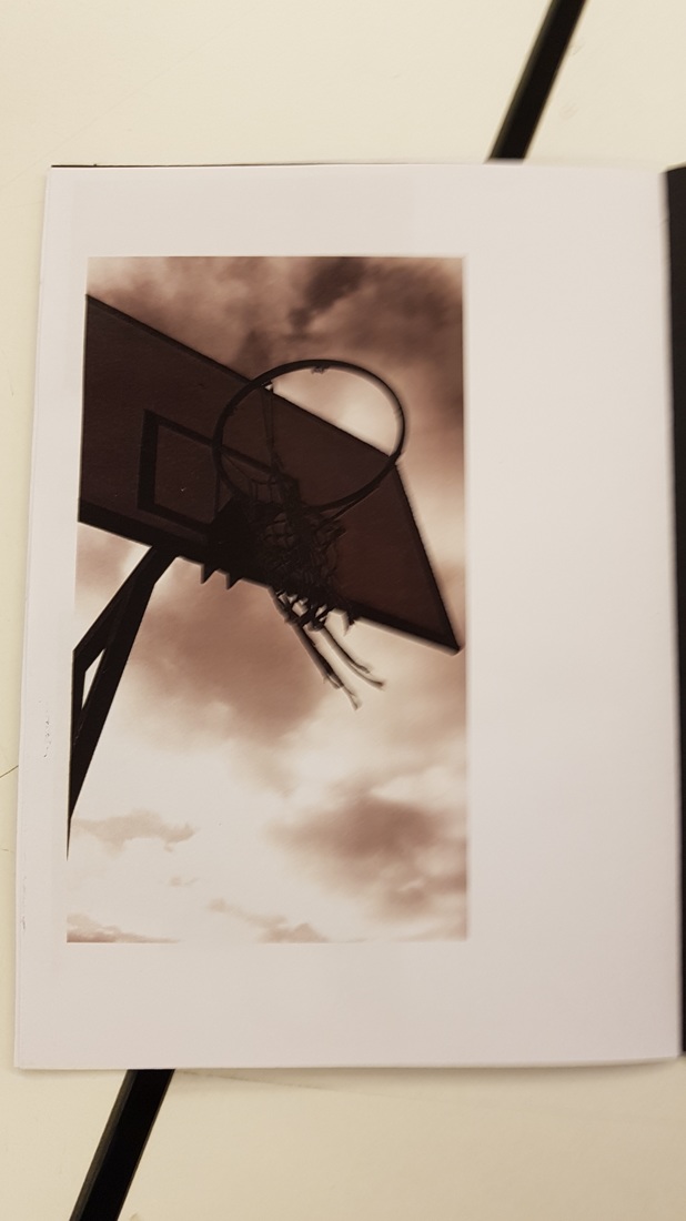
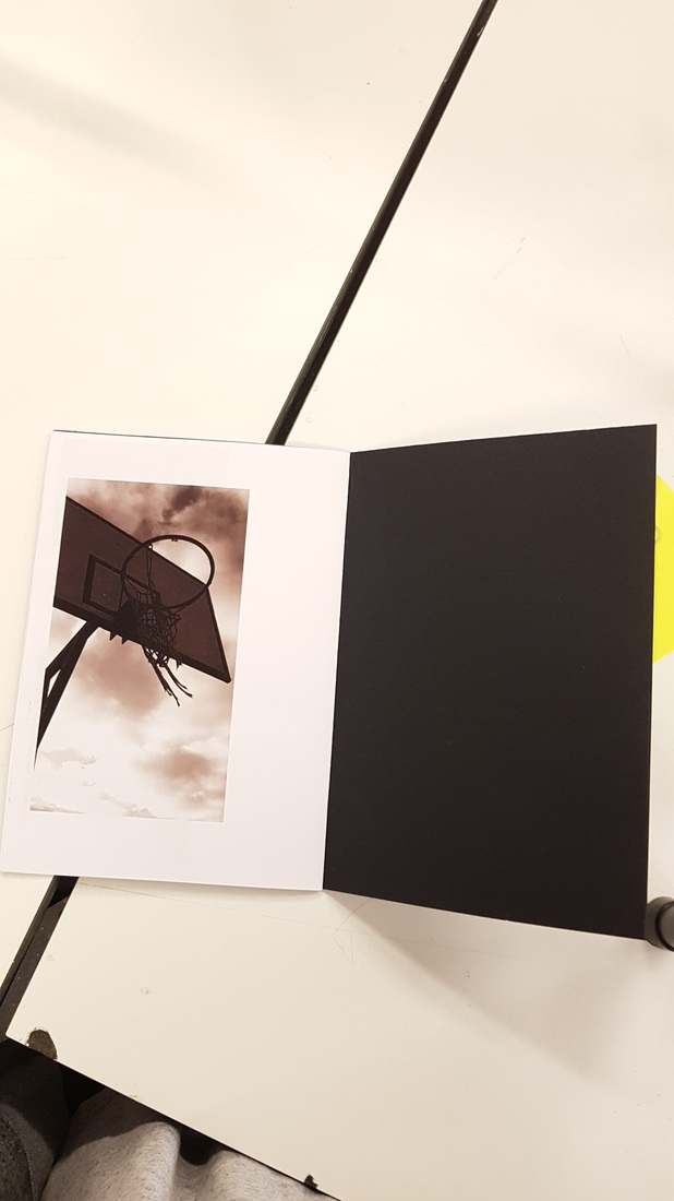
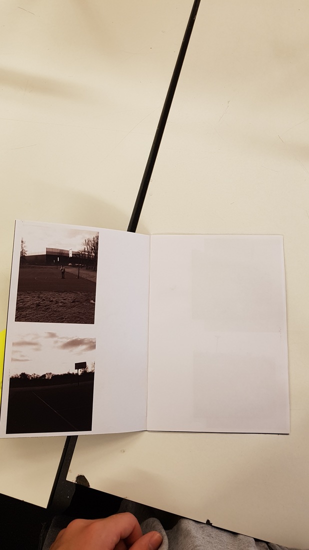
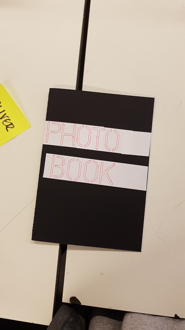
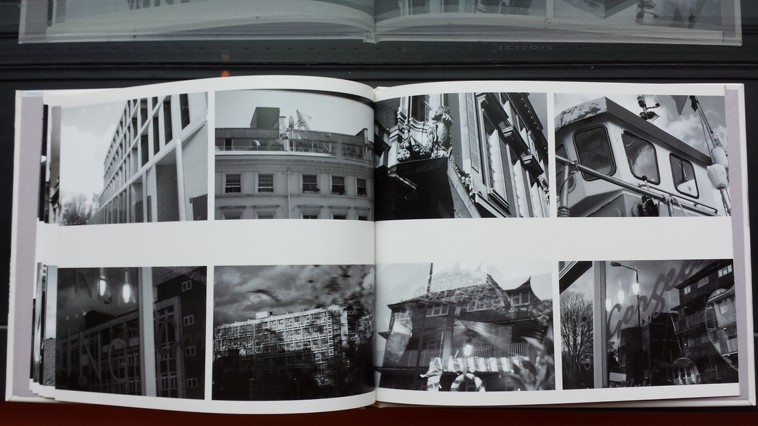
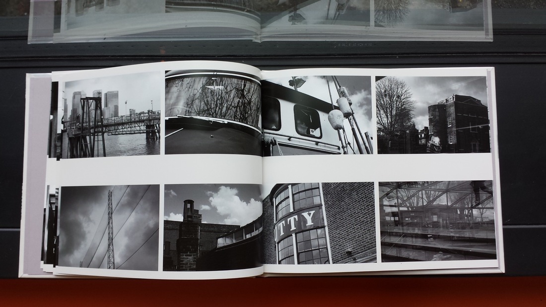
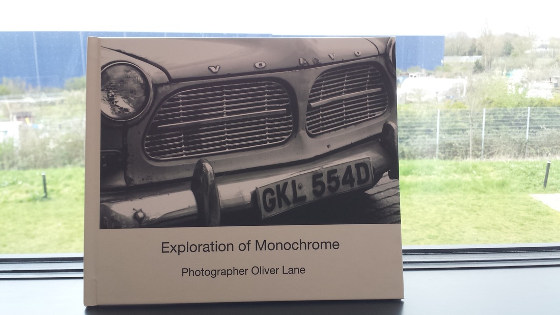
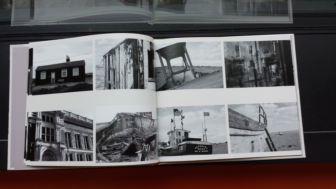
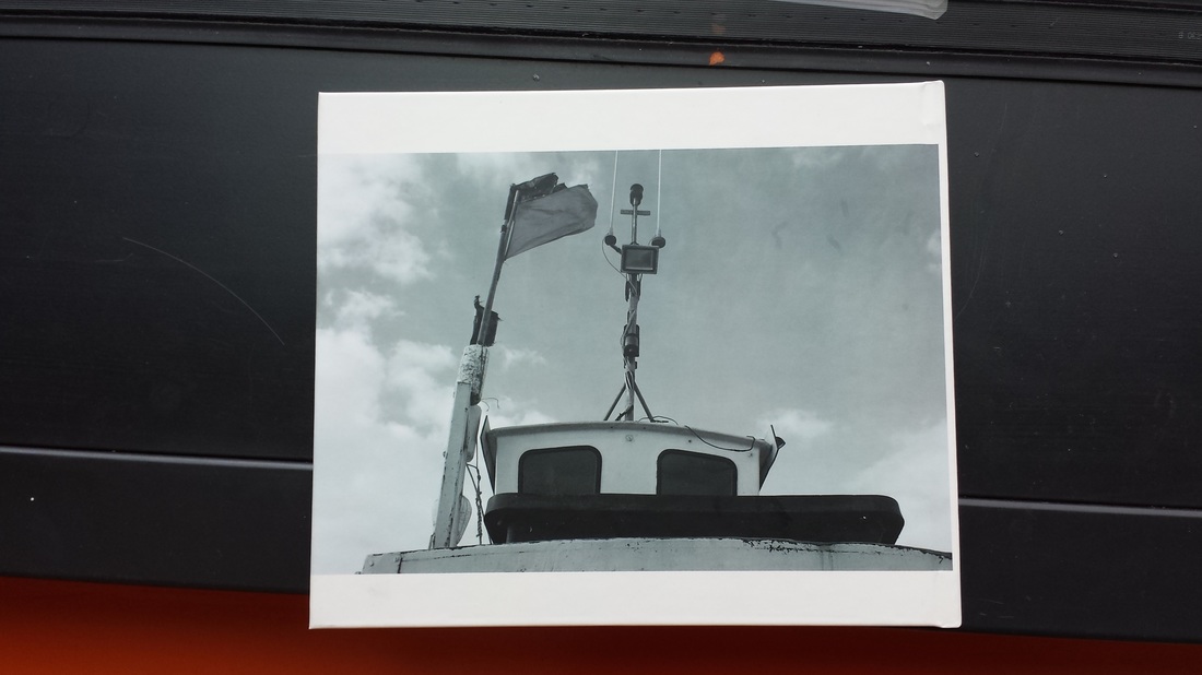
My finished photo book
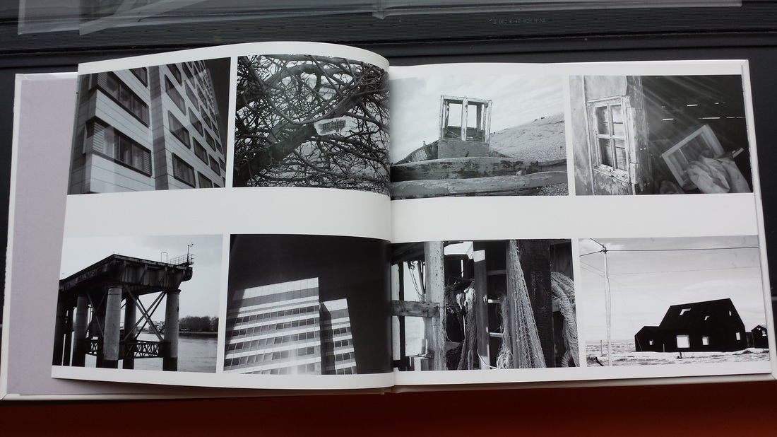
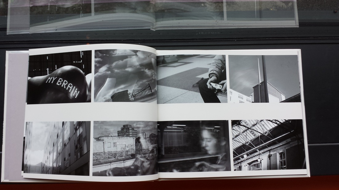
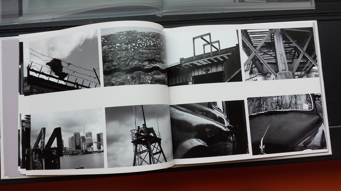
The main artists that I researched during this research was mainly William gedney his photo book that he did in partnership with another photographer called John cage. another couple of artists i researched was Luke flower along with Ihei Kimura, Joel Meyerowitz and Kishin Shinoyama I used all of these photographers and there books to help me with the idea for my book e.g. the reason why I decided to do black and white is one i was all ready interested in black and white photography but when i researched William Gedneys and Johan cages book the contrast and the style of the photos in black and white really caught my eye. what i like about this book is that it does have a similar style to William gedney with the contrast and one of the reasons why I named it exploration of monochrome as I explored that based of gedneys work. but what I dislike about this photo although one of the themes is randomness it should really of had more thought put into the the place meant of the photos and what photos look best next to each other. The main difficulties I ran in to where that on the website blurb which is the website I use to create and order it from I found that if you simply added more pages on it would add a load on to the bill so I had to reduce the pages to the standard and put four photos on each page but after other people looking at the book they though it adds to the style and is one of the things that make the book interesting and good. what people may say about it is that even though the randomness makes it interesting you could of maybe thought about it and put dates and locations to make it make sense. If i did it again what i would maybe incorporate colour images and mix them in and one of my ideas was to take a black and white photo of some think really colourful then maybe put the colour back into a part of the picture i.e. a women wearing a red coat and that would be the only thing in colour out of the whole black and white picture. another thing I would change if I did it again would be to make it not at all random and well thought out laid out in the book with location and time and maybe what camera I used. What I thought was most effective about this book is the style of how it is laid out random and maybe a bit of my own style of photography, another effective this was the layout the feed back I got was that having four images per page is one of the things that made it that bit more interesting. My book was heavily influenced by a collection of artist but the best one was Joel Meyerowitz who had some great street black and white photography which inspired me to do my photo book in that style.
