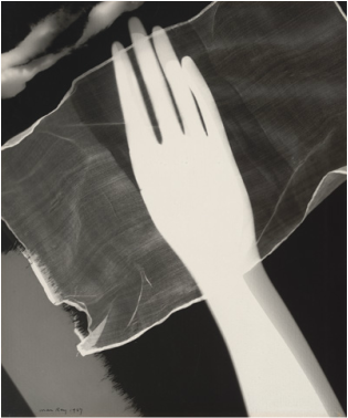
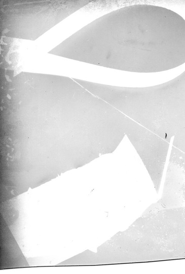
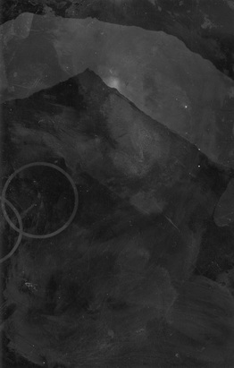
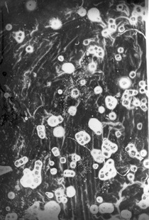
Man Ray
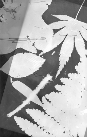
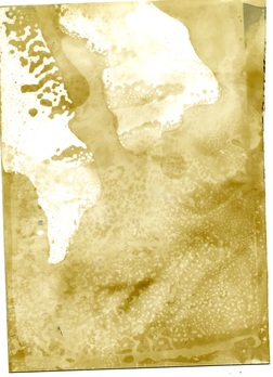
The techniques that ray uses to create this photogram is to use every day objects such someones hand or a bit off clothing to create these very clever photograms and he must have had the light on it for a long time as the hand has a over exposed look to it. he must also have chosen to take the photogram out of the developer to create this over exposed look. The big formal elements that you see in this photogram is mainly different tones and how they have made certain objects stand for example the tone of the hand is very white comparing to the dark tone of the cloth behind it. another formal element is the texture of the photogram e.g. the cloth behind the hand has a very rough but smooth surface at the same time, a third formal element would be the lines in the image are very jagged or smooth and none of them are a nice smooth straight line but the lines that you do see at to how this photo really stands out. A fourth formal element would be shape as it varies e.g. the cloth behind the hand is a rectangle shape but its eges are very jagged and not straight.
The techniques that ray uses to create this photogram is to use every day objects such someones hand or a bit off clothing to create these very clever photograms and he must have had the light on it for a long time as the hand has a over exposed look to it. he must also have chosen to take the photogram out of the developer to create this over exposed look. The big formal elements that you see in this photogram is mainly different tones and how they have made certain objects stand for example the tone of the hand is very white comparing to the dark tone of the cloth behind it. another formal element is the texture of the photogram e.g. the cloth behind the hand has a very rough but smooth surface at the same time, a third formal element would be the lines in the image are very jagged or smooth and none of them are a nice smooth straight line but the lines that you do see at to how this photo really stands out. A fourth formal element would be shape as it varies e.g. the cloth behind the hand is a rectangle shape but its eges are very jagged and not straight.
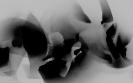
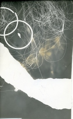
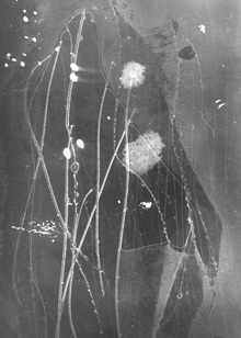
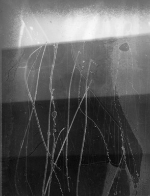
Moholy Nagy
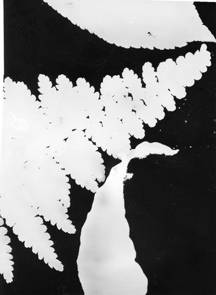
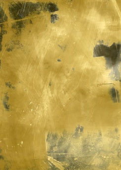
The techniques that moholy used to form this very well done photogram is very hard to find but i think that he used semi-transparent light-refracting objects and adding natural ambience to create these strange but interesting shapes that all most look light birds wings in some parts of it. There are very few formal elements in this photogram and the main one is tone which is constantly changing with the use of the semi-transparent light-refracting objects but does give out a very nice look. another formal element is colour which is white, grey and black but these different colours really help the image to become a outstanding use of objects.
The techniques that moholy used to form this very well done photogram is very hard to find but i think that he used semi-transparent light-refracting objects and adding natural ambience to create these strange but interesting shapes that all most look light birds wings in some parts of it. There are very few formal elements in this photogram and the main one is tone which is constantly changing with the use of the semi-transparent light-refracting objects but does give out a very nice look. another formal element is colour which is white, grey and black but these different colours really help the image to become a outstanding use of objects.
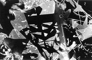
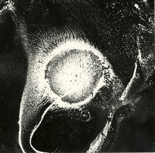
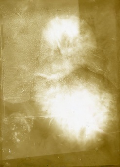
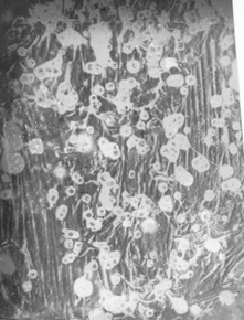
Floris Neususs
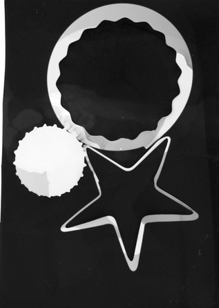
The techniques that Floris used to create this very interesting photogram must have been very diffcult and complicating as there seems to be allot going on in the photogram. also he must have played around with the amount of light he let in and and for how long as it has come out in a very strange way. The objects that Floris must have used to create this photogram look like in certain parts that paint has been simply squrtied on it also on the top left hand corner there is what looks like grass and a few objects that are in the shape of a butterfly.
The techniques that Floris used to create this very interesting photogram must have been very diffcult and complicating as there seems to be allot going on in the photogram. also he must have played around with the amount of light he let in and and for how long as it has come out in a very strange way. The objects that Floris must have used to create this photogram look like in certain parts that paint has been simply squrtied on it also on the top left hand corner there is what looks like grass and a few objects that are in the shape of a butterfly.
write up of lessons experiments
in the lesson today i went into the dark room to experiment with photograms and which objects went well and which did not. often transparent objects work well e.g. in the experiment today the second photogram i used a transparent pen which turned out well although the transparent stencil did not turn out quite how i thought it would. The first image i did went badly mainly because i did not put my chosen objects under the light before i turned it on causing no shapes to appear when i put it in the developer. how ever the second photogram i did came out very well as i did not make the mistake like before. The reason for my second image turning out well was i left the light open for roughly 30 seconds which must of allowed it to turn out well when i moved onto the next stage of developing.
in the lesson today i went into the dark room to experiment with photograms and which objects went well and which did not. often transparent objects work well e.g. in the experiment today the second photogram i used a transparent pen which turned out well although the transparent stencil did not turn out quite how i thought it would. The first image i did went badly mainly because i did not put my chosen objects under the light before i turned it on causing no shapes to appear when i put it in the developer. how ever the second photogram i did came out very well as i did not make the mistake like before. The reason for my second image turning out well was i left the light open for roughly 30 seconds which must of allowed it to turn out well when i moved onto the next stage of developing.
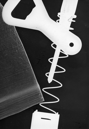
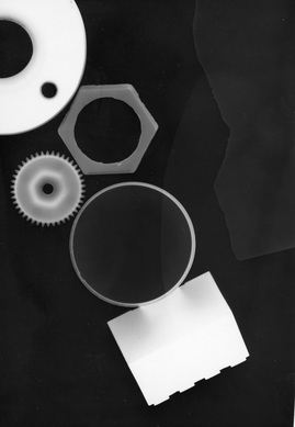
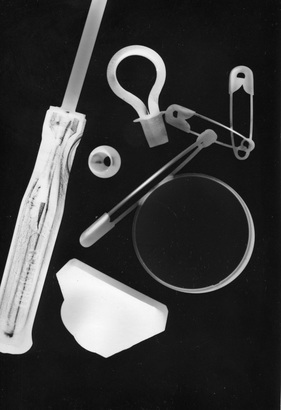
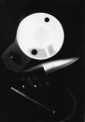
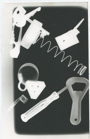
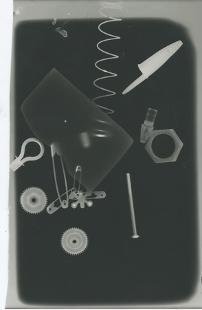
every day objects used in photograms
evaluation/write up of the photograms
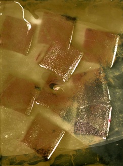
To create these four photograms i used your any day objects. The bottom right photogram had the light on it for 50 seconds which meant is why most of the objects used to create it did not appear when it was being developed. with the rest of the photograms which turned out much better because i had the light on it about 30 seconds with a bright light shining on them. Out of the four the photogram i thought that turned out the best was the bottom left as it mostly has the same shaped objects used as well as being developed the best out of them and had the light on for the right amount of time for it to be good. But the photogram that turned out the worst was the bottom left as it was left to long and exposed to the light as well as being developed badly as it was in the developing chemical for not long enough which meat it did not turn out as well as it could have. What i think is effective about these photograms above is how some of the objects used tend to look different depending on the material the object is made out of for example the screw driver on the bottom left has a handle made from transparent plastic which has a very interesting look to it. what other people may think of the work is that i could have arranged the objects in a better way to create a over all better look. But what works well with these photograms above is that are some of the materials used such as the transparent plastics work really well in the sense that the look very transparent which I think look very interesting.
To create these four photograms i used your any day objects. The bottom right photogram had the light on it for 50 seconds which meant is why most of the objects used to create it did not appear when it was being developed. with the rest of the photograms which turned out much better because i had the light on it about 30 seconds with a bright light shining on them. Out of the four the photogram i thought that turned out the best was the bottom left as it mostly has the same shaped objects used as well as being developed the best out of them and had the light on for the right amount of time for it to be good. But the photogram that turned out the worst was the bottom left as it was left to long and exposed to the light as well as being developed badly as it was in the developing chemical for not long enough which meat it did not turn out as well as it could have. What i think is effective about these photograms above is how some of the objects used tend to look different depending on the material the object is made out of for example the screw driver on the bottom left has a handle made from transparent plastic which has a very interesting look to it. what other people may think of the work is that i could have arranged the objects in a better way to create a over all better look. But what works well with these photograms above is that are some of the materials used such as the transparent plastics work really well in the sense that the look very transparent which I think look very interesting.
experimented paper photograms
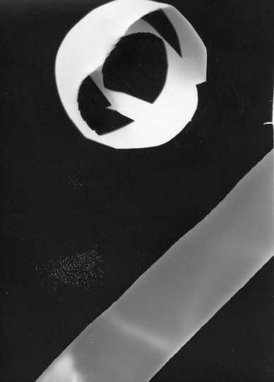
Write up of lesson/Evaluation of Photograms
To create these photograms above i simply used strips of paper that have been placed under the light for different times then put into the developer for roughly two mins then but in the middle tray which is the fix for one minute then into the final tray for another two minute and the washed in water and hanged up to dry. in my opinion out i like the photogram on the right as even though it is very over exposed and not come out very well you can still see the lines of the paper which i find very interesting. With the image on the left the light was on it for 2 seconds which is why it is allot clearer and looks better in certain aspects of it, the light was on 22 which is quite low setting but has worked. The image on the right as seen did not turn out as the first one because of the time it was open for which was five seconds with an aperture of 4.5 which is what has given it this overexposed look. what I think works well with these photograms above is that the use of the paper that has been bent to create some very interesting effects. but what I think did not work well is the photogram on the right which for some reason has a kind of grey faded effect which I not sure how it happened weather it was when I was shinning the light onto it or during the developing process. But what I think is effective about this kind of photography is that some times those mistakes can course peace's of work to come out even better for example with the one on the right in my opinion looks really interesting In the way that the grey effect has given it a rustic old look. what I think is worth remembering about these particular photograms Is that the simplest of materials used can create some very good and interesting looks.
To create these photograms above i simply used strips of paper that have been placed under the light for different times then put into the developer for roughly two mins then but in the middle tray which is the fix for one minute then into the final tray for another two minute and the washed in water and hanged up to dry. in my opinion out i like the photogram on the right as even though it is very over exposed and not come out very well you can still see the lines of the paper which i find very interesting. With the image on the left the light was on it for 2 seconds which is why it is allot clearer and looks better in certain aspects of it, the light was on 22 which is quite low setting but has worked. The image on the right as seen did not turn out as the first one because of the time it was open for which was five seconds with an aperture of 4.5 which is what has given it this overexposed look. what I think works well with these photograms above is that the use of the paper that has been bent to create some very interesting effects. but what I think did not work well is the photogram on the right which for some reason has a kind of grey faded effect which I not sure how it happened weather it was when I was shinning the light onto it or during the developing process. But what I think is effective about this kind of photography is that some times those mistakes can course peace's of work to come out even better for example with the one on the right in my opinion looks really interesting In the way that the grey effect has given it a rustic old look. what I think is worth remembering about these particular photograms Is that the simplest of materials used can create some very good and interesting looks.
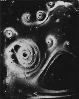
Pierre Cordier.
|
|
|
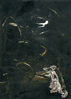
Research on Pierre Cordier
pierre was born January 28th, 1933 in Brussels in Belgium and first stared doing photograms after being incurred by the great poet Georges Brassens who also gave Pierre advice, later on the 10th November 1956 Cordier invented whats called the chemigram technique that combines different aspects of painting (varnish, wax, oil) and the chemristy of photography. later in his life he went on to study under the teacher Otto Seinert and for a time waist still studying under Seinert he made his carrier as a photojournalist in far flung places such as Iraq. later From the 1960s until the mid 1970s Cordier continued his experiments chromatic research (1961), the photo-chemigram (1963), and magical varnish (1972). evaluation of image by Pierre Cordier
What i think worked well and is effective about this image is how it has a kind of pattern in the way that the strange looking line kind of repeat them selves. what i think is worth to remember about this image is how it is very full of different shapes and patterns. what i dislike about this images is that it is a bit overwhelming as there is so much going on that its hard to keep track of what is what. what I think is worth remembering about Cordiers photograms is that he has created some very good photograms such as the one of the face on the left one down where it appears to be a image of a fishes face and I think looks very good. what I like about his work is how if varies in style in the way that some are patterns with colour and others images such as the face one above are very different. How this compares with some of his other work is that some I think come up to a very high stranded and are very good and then with others not so good such as the one directly on the left is good but comparing to the one above not so good. |
|
|
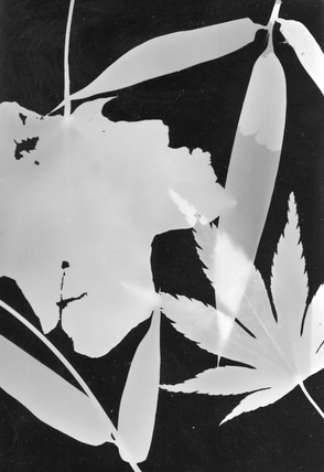
organic and metal objects
|
|
Evaluation of photograms above.
what i think has worked well in these photograms is the use of more interesting and different objects such as the leaves work very well and have turned out very well. what i like is how the image at the top left the leave have come out as looking a bit transparent for some strange reason as it had the same exposer time as the other one on the right but has turned out slightly differently.
what i dislike is the bottom one as i could have put more objects to create a better effect on the hole photogram as well as use more metal objects. what I think works well with these photograms above is how each one has come out differently but each one has it differences that makes it special. what is worth remembering about these photograms is that even if you have the same settings on the enlarger each time you did each photograms I can still surprise you by each one turning out differently. what other people may think of it I'm not sure in the sense that some may think the differences in them look good but some may think they look bad. How I compare these photograms my other ones is that in some causes the chosen objects looked but with other ones its how they have come out and weather the whole thing works. what I dislike about the one on the bottom left is that the objects could be allot white, another thing is that the black background could be allot blacker.
experiments of with light
evaluation of photograms
As you can see out of these three photograms three of them I use the same objects but changed the aperture as well as the amount of time the light was shing on the peaces of paper to try to get the white parts to have less dark packages and just sold white spaces. But the photogram I thought turned out is the best is the one on the right which I decided has the brightest whites even though the black background has turned out a very light grey kind of colour the whiteness of the strip of paper really stands out and even may be a bit over exposed. What has these photograms is my constant attempt to get the solid white part of the photogram to come out the whitest and the black come out the darkest. What I think went badly was the top right photogram which has turned out very badly because it had a short exposer time and not much light which has caused that effect of the object not showing up very well and being very hard to see. what other people may think of these images its that I could have kept trying with the experimenting and go a final photogram that had the right level of black and white. |
|
1.
3.
5.
|
2.
4.
6.
|
evaluation of chemigrams
out of the six images the one i thought worked really well was the coffee one that i simply got a tissue with coffee on it and applied it all of over the photo paper and i think it came out better then i thought as after a 48 hours to dry has given it a really interesting and good effect. But in response to this image i would maybe integrate it with another chemical to give a better effect. But out of the six what i think worked the worse was the nail varnish as even though it had 48 hours to dry came out in a really dark way and only a part of it has come out at all as you can see. how ever the one i dislike the most its the other nail varnish one with the oil bleach and other chemicals but what i dislike is that it is a bit non artistic and comparing to the other nail varnish one it in my opinion looks better. what has influenced my work the most is that I'm free to use and experiment with any chemical i wish which i think is really good. The one thing i have learned from this work is that to never be worried about using new and different chemicals to create new and interesting effects. Another image i think has worked well is the red ink pad one where i got a ink pad and simply applied to the photo paper and put it in the developer then the stop then finally the fix which has given it this very interesting and a bit of a different look. ADD MORE DETAIL.
out of the six images the one i thought worked really well was the coffee one that i simply got a tissue with coffee on it and applied it all of over the photo paper and i think it came out better then i thought as after a 48 hours to dry has given it a really interesting and good effect. But in response to this image i would maybe integrate it with another chemical to give a better effect. But out of the six what i think worked the worse was the nail varnish as even though it had 48 hours to dry came out in a really dark way and only a part of it has come out at all as you can see. how ever the one i dislike the most its the other nail varnish one with the oil bleach and other chemicals but what i dislike is that it is a bit non artistic and comparing to the other nail varnish one it in my opinion looks better. what has influenced my work the most is that I'm free to use and experiment with any chemical i wish which i think is really good. The one thing i have learned from this work is that to never be worried about using new and different chemicals to create new and interesting effects. Another image i think has worked well is the red ink pad one where i got a ink pad and simply applied to the photo paper and put it in the developer then the stop then finally the fix which has given it this very interesting and a bit of a different look. ADD MORE DETAIL.
hand made negatives
|
|
|
|
evaluation/lesson write up
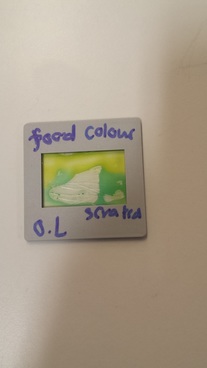
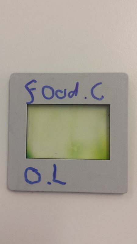
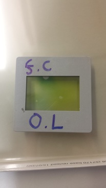
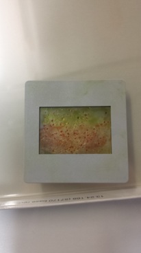
To create these negatives is to simply to cut out a small peace of asotape then apply the a chemical such as food colouring with a paint brush in any way you like then simply put another peace of cut up asotape and then place it on top of the first peace and then put the frame around it and your done.
Out of the four homemade negitives that you can see above the one I think that has worked out the best is the second one along which has worked out well because of how the two colours and green and blue have mixed in a very interesting way. But out of the rest the one i think has turned out the worst is is the salt and Vaseline along with the food colourings has been done in the wrong way so that the vaseline has not reacted to the salt along with the food colouring to create the effect. How I could improve the salt and vasilne one is to maybe do it in the correct order along with not using more then one colour. what I find most interesting about these four images is how the colours have changed and mixed to create some very interesting mixes of colours. one thing I disliked about the process part is the limited use of food colourings along with the on the chemicals and materials used to create the negatives. what I think has worked well with these hand made negatives is how each one had its own qualities which make it good. what other people may think is that of my works that some of them have not quite turned out well for example the salt and Vaseline negitive i did it in the wrong order of applying each material which has resulted in them not reacting and creating good effect. I can compare the hand made negatives by simply comparing to the other negatives I made and how some came out better because that changed over time as well as when I was making them I did each one in a slightly different way which has caused a slightly different effect on each one.
hand made negatives printed photograms
|
|
|
evolution
what Influenced these negative prints is the hand made negatives above which then using a enlarger with the hand made negative I enlarged them onto a peace of photograph paper to create the images above. what is worth remembering about these photograms is that if you mange to the get the right amount of light as well as the exposer time for one most of the time the rest will turn out the same but having said that the two salt and Vaseline prints where at the same F stop of 8 and the same exposer time of 3 seconds but the smaller one which is also the second one has turned out to be lighter then the first one I did. additionally what other people may think is that each one of the prints is that each one has something that makes it good and aspect that makes I bad as well as thinking I could have thought about the exposer time a bit more with the second salt and Vaseline photogram. how do they compare with each other?. well each one is slightly better in the way that even though the first to salt ones where on the same settings but did not turn out the same then there is the last one which has turned out differently some each one in comparison is slightly different.
what Influenced these negative prints is the hand made negatives above which then using a enlarger with the hand made negative I enlarged them onto a peace of photograph paper to create the images above. what is worth remembering about these photograms is that if you mange to the get the right amount of light as well as the exposer time for one most of the time the rest will turn out the same but having said that the two salt and Vaseline prints where at the same F stop of 8 and the same exposer time of 3 seconds but the smaller one which is also the second one has turned out to be lighter then the first one I did. additionally what other people may think is that each one of the prints is that each one has something that makes it good and aspect that makes I bad as well as thinking I could have thought about the exposer time a bit more with the second salt and Vaseline photogram. how do they compare with each other?. well each one is slightly better in the way that even though the first to salt ones where on the same settings but did not turn out the same then there is the last one which has turned out differently some each one in comparison is slightly different.
|
write up of the tested one
with the photogram above I chose one of my hand made negatives and then simply put it into the enlarger at the brightest F stop for 20 seconds but using a peace of cardboard I moved that across the paper at 5 second intervals so I could find out the best exposer time. add more |
|
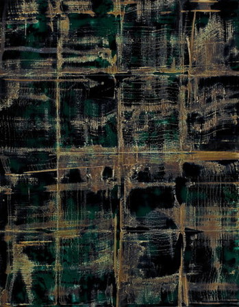
Experimental photographer : Marco Breuer
|
Marco is mainly famous from creating very good and interesting photograms using different and interesting techniques such as the photogram on the right which is a chromogenic paper, exposed, folded and burned create this in my opinion very creative but strange as when I first it did not seem to look like a photogram but a old bit of leather or fabric.
The kind of materials that he uses are by the look of it peaces of paper leather that has been burned or bent as well as being exposed and developed in certain ways. another type of maternal used in his work chromogenic paper that is often burned in a certain way to create these wonderful photograms. unlike most photographers who use lots of different types of photography to create there work Marco only does photograms to create the images in very creative ways. with his work unlike other types of photography photograms a very different along with there being certains things you can create with photograms that you can not create. my opinion on his work is that it is very good and creative how the thinks of different methods and materials to create the interesting and wonderful photography along with a lot of his work being very colourful. |
